
Portly was hand-written by humans (me, specifically) with minimal AI input. For the moment, at least, I believe that nothing beats good old-fashioned human craftsmanship !

The performance drilldown screen
The drilldown screen enables you to interactively explore your portfolio in fine detail, to really understand what's driving your P&L. It works a bit like a pivot report in a spreadsheet app; you choose a series of attributes that are used to split your portfolio, decomposing it into smaller parts. You can then view the performance of each component individually. Here's a closer look at how it works :
Step 1 : decide what grouping you want to see
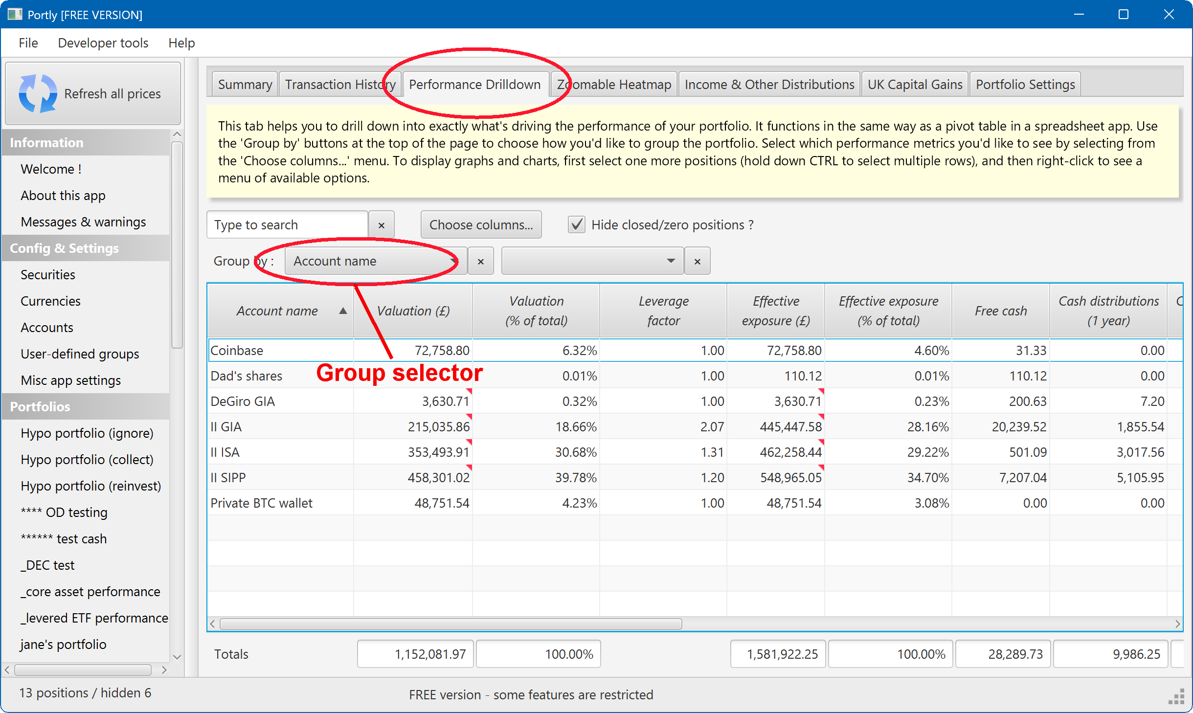
When you first open the drilldown screen, it will look something like this. The portfolio is currently being grouped/split by account name, causing each account to appear on a separate row of the report. Alongside each account, you can see a few standard performance-related values :
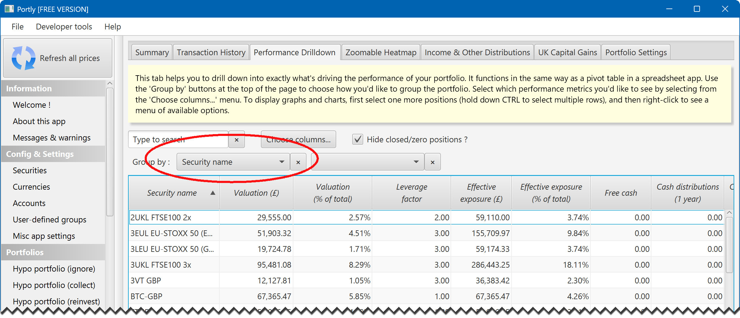
How about how about grouping by security name instead ? Simply click on the group-by listbox and change the setting to 'Security name'. Now you can see the performance of each individual stock in your portfolio :
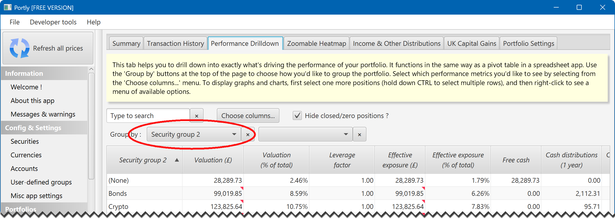
Of course, you can also group your holdings using any user-defined groups that you have assigned. In the next picture, I have organised the report using the 'Security Group 2' tag. All securities that were previously marked as (eg) bonds are now gathered into a single row of the report. Obviously, the exact results that you'll see in your own portfolio will depend on how you've set up your own tags :
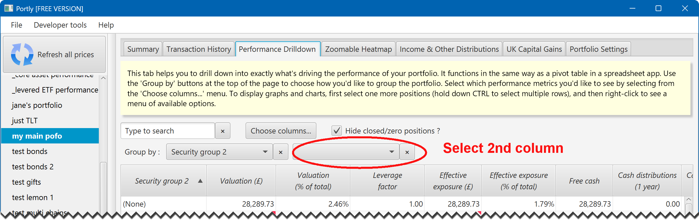
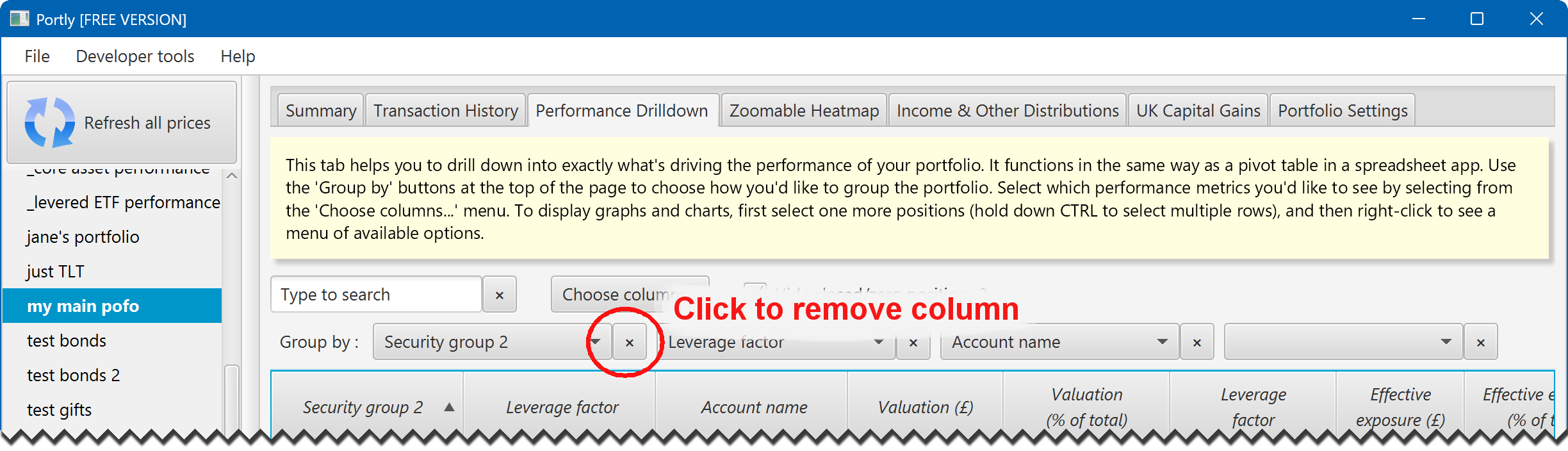
What about grouping by more than one attribute ? That's simple. To add another group-by column, just click on the second listbox (the one that's currently empty) :
You can repeat this process to add as many group-by columns as you like, effectively dividing the portfolio up into smaller and smaller components.
To remove a column, simply click the small 'X' button next to the column's name :
Step 2 : decide what other columns you'd like to see
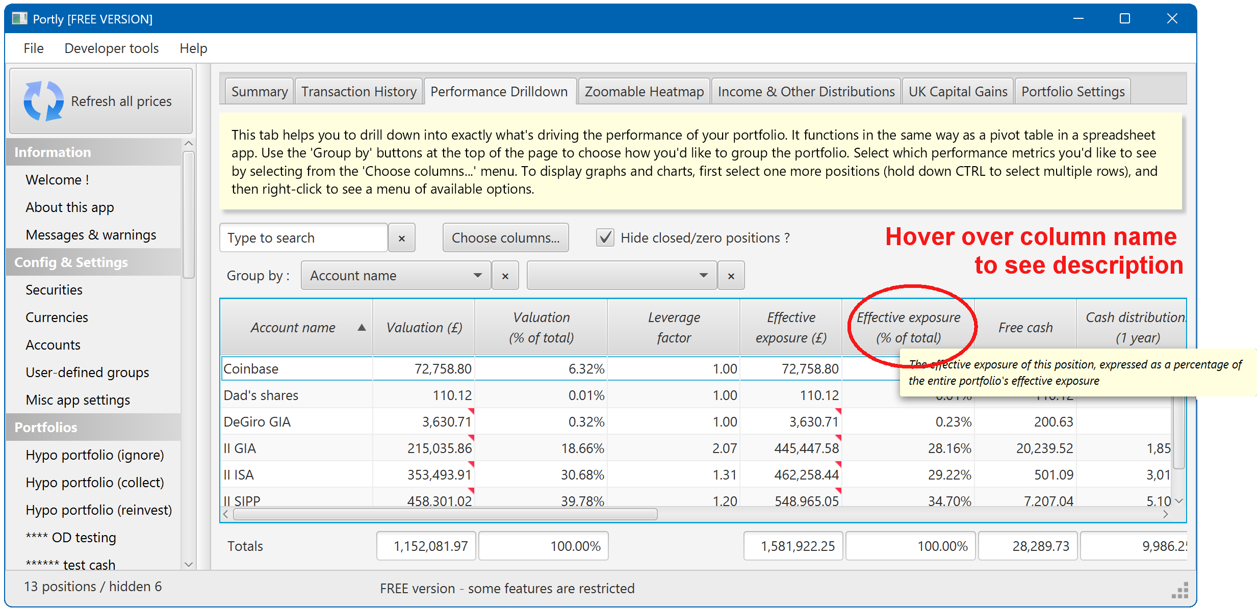
When it first opens, the drilldown report will show commonly-requested values such as Valuation and Current Drawdown. You can see a definition of each column by hovering your mouse over the column name :
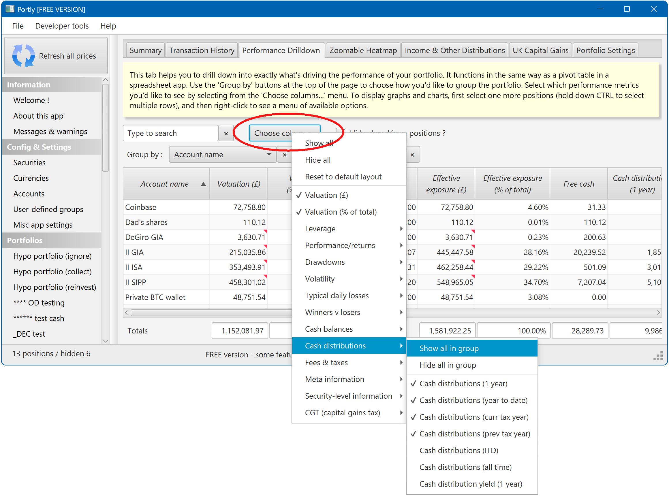
To add more columns, click the 'Choose columns...' button. You'll be presented with a menu of all the available values :
Step 3 : Drawing charts
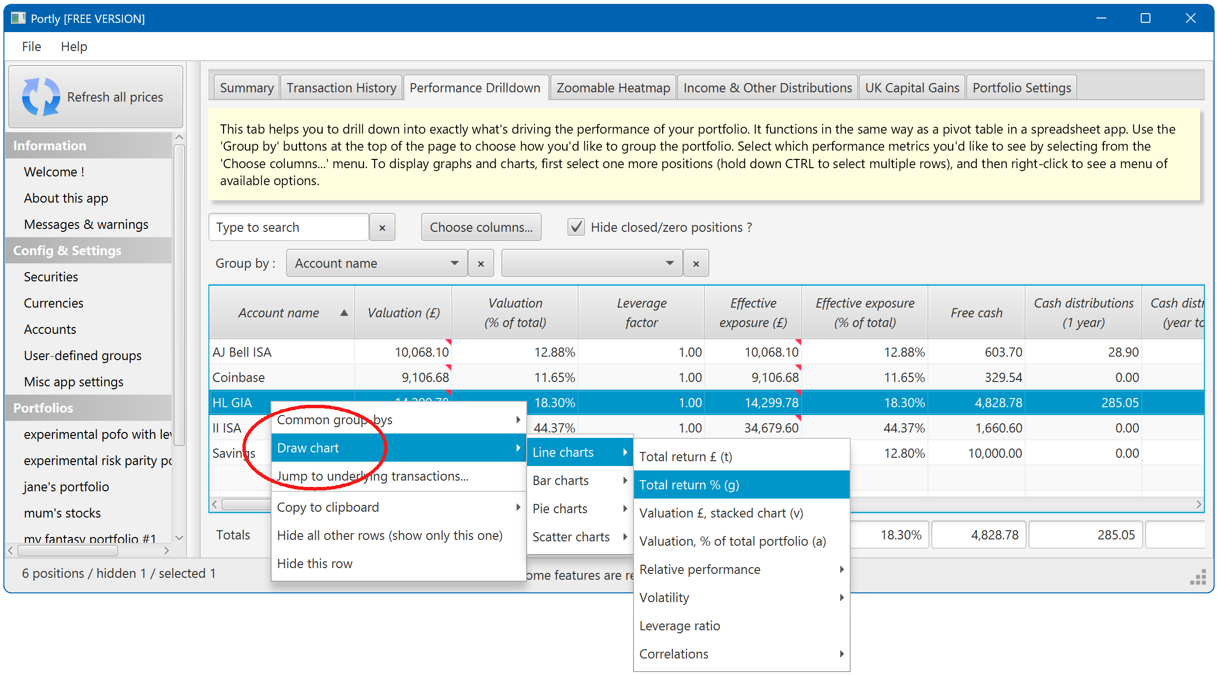
The drilldown report also gives you the ability to generate charts of your portfolio performance. There are lots of possibilities. At its simplest, you can generate a chart for a single row of the table. Just right-click on the row, and select the chart you'd like to see :
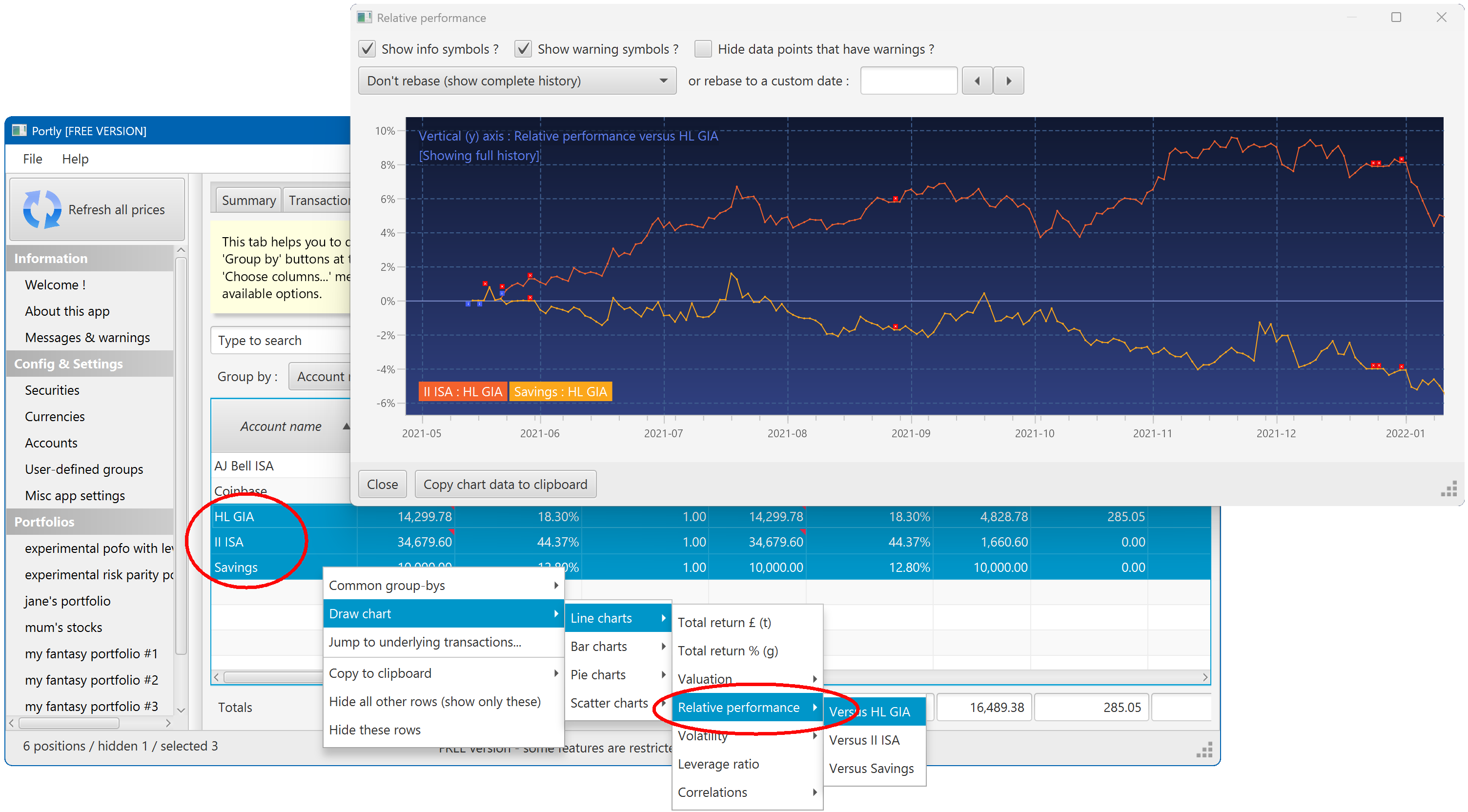
It's also possible to plot multiple positions at once. To do this, hold down the CTRL or SHIFT keys while clicking on the rows you want to select. Then right-click to bring up the chart menu. With multiple positions selected, you'll see several new charting options. Here's an example of the relative performance chart, the plots the performance of each selected position against a 'base' position :
Step 4 : Other useful stuff
Just a few more tips & tricks...
- The drilldown report doesn't let you edit your portfolio directly, it's read-only. If you want to make edits, right-click and choose the 'Jump to underlying transactions...' option. That'll jump to the transactions tab, with all the relevant rows selected. From there, you'll be able to make any necessary changes.
- Pressing 's' will add 'Security Name' as one of the group-by columns, or remove it if it's already there (this is a quick way to toggle security-level reporting on and off)
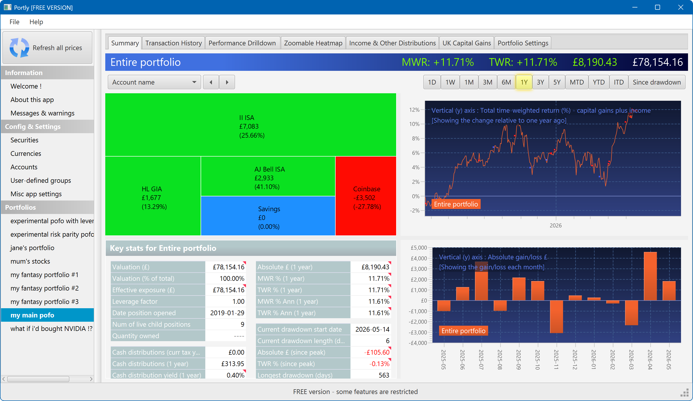
The summary screen gives an at-a-glance overview of your portfolio's performance. To read more about it, click here
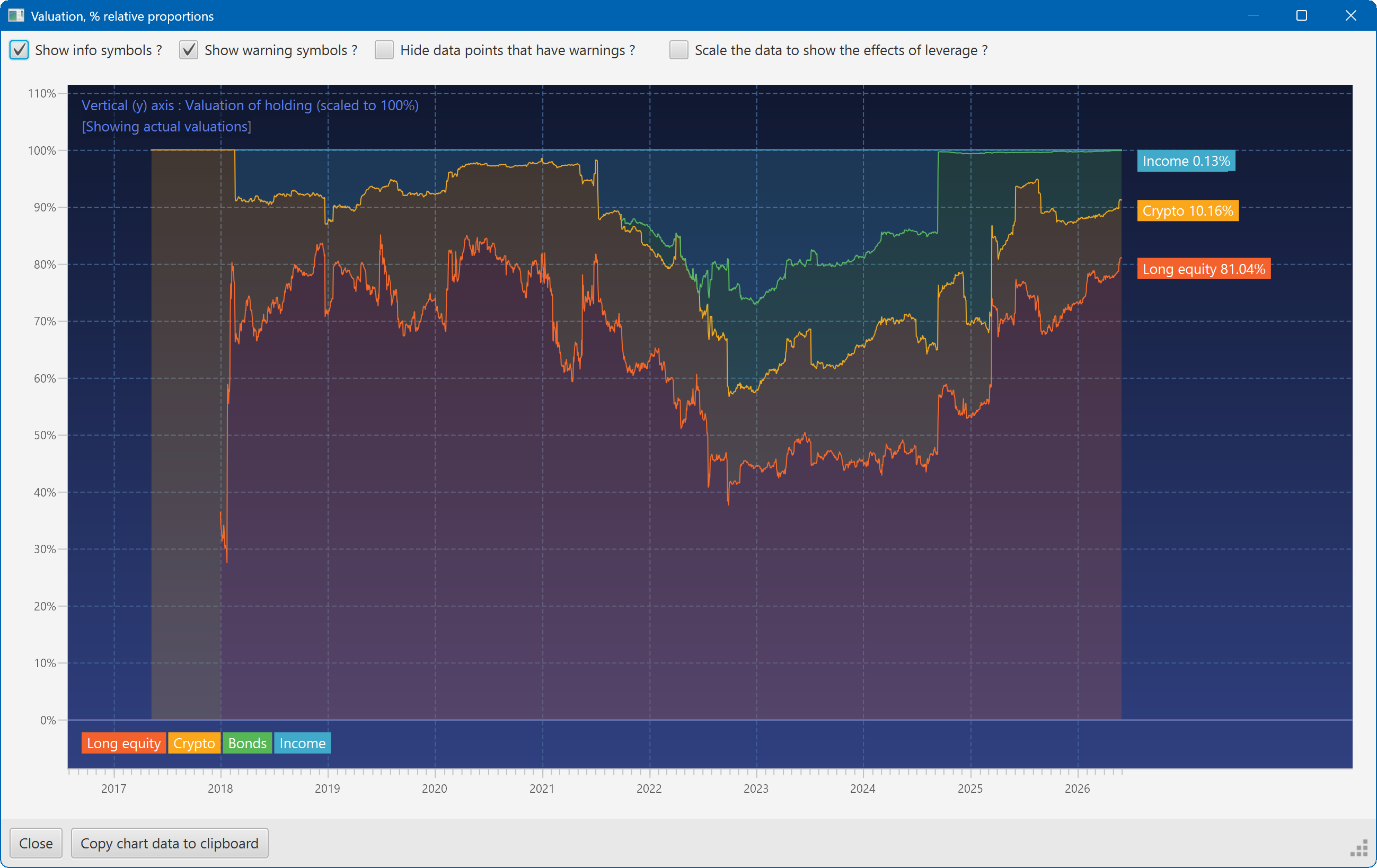
This plot shows the changing composition of a portfolio over time. It uses user-defined groups to organise the assets into different classes.
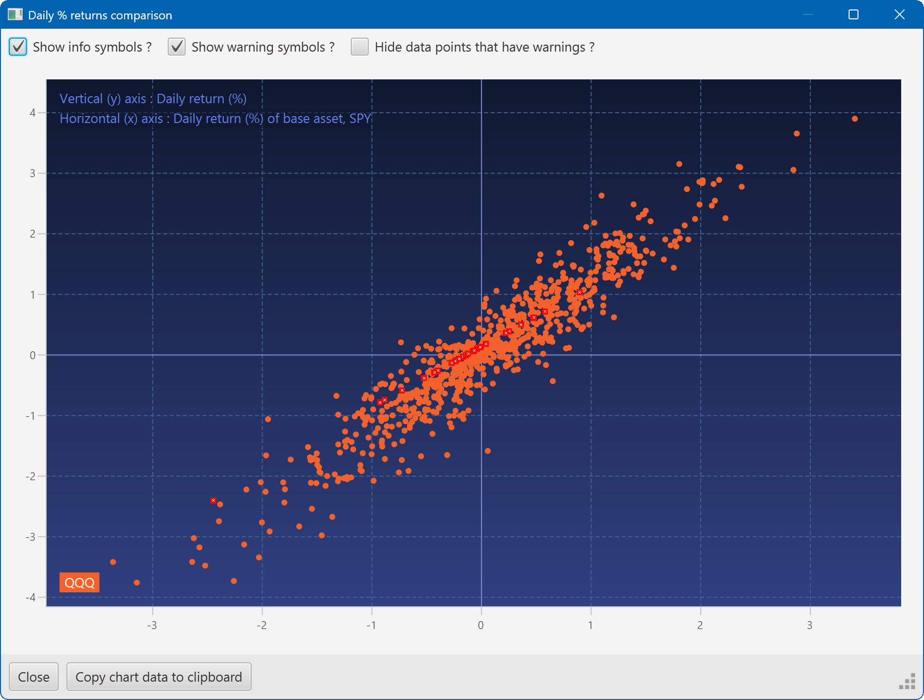
A scatter plot, showing how the daily moves of one security (QQQ) relate to the daily moves of another (SPY)
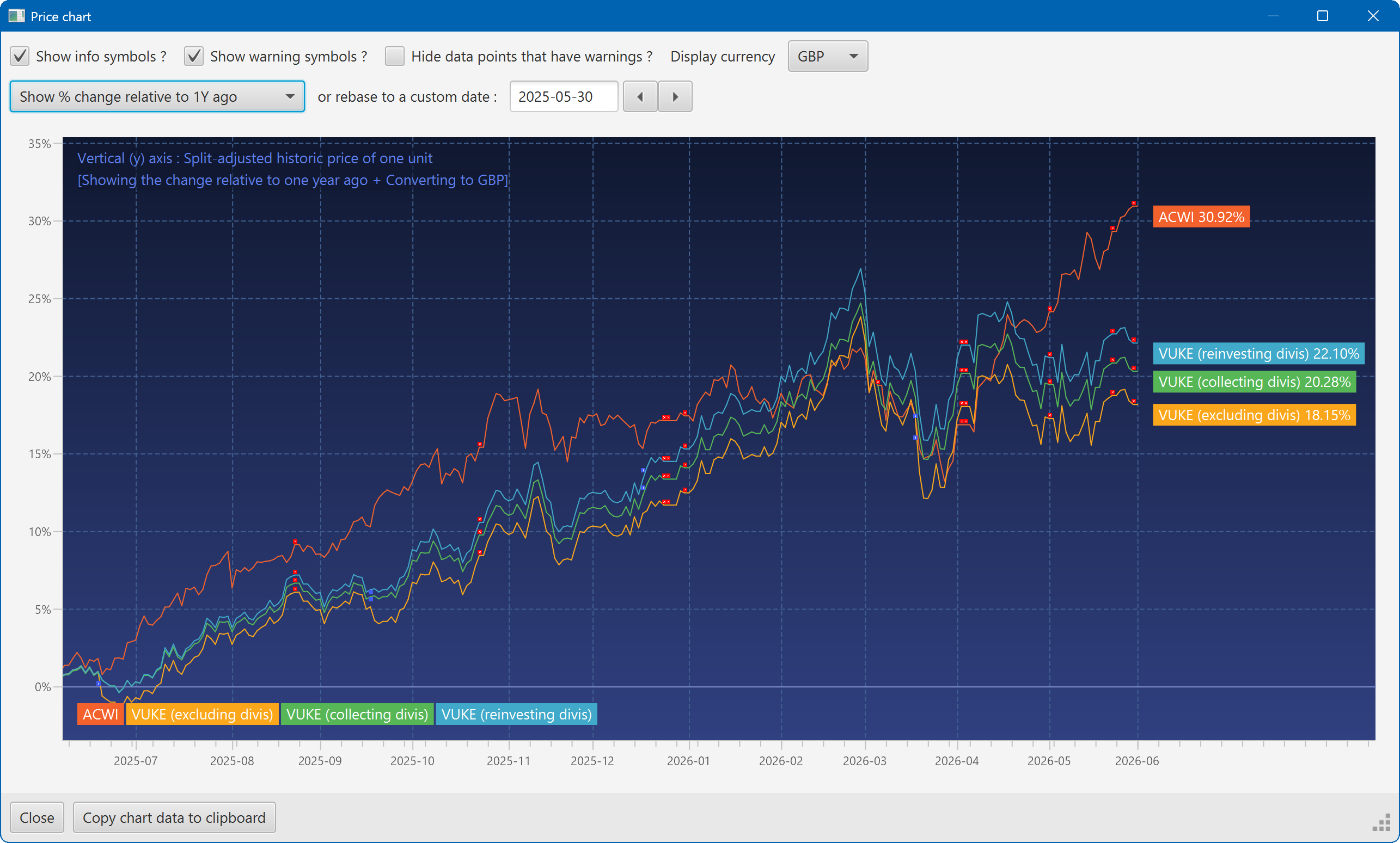
A chart showing the growth of two securities over the past year
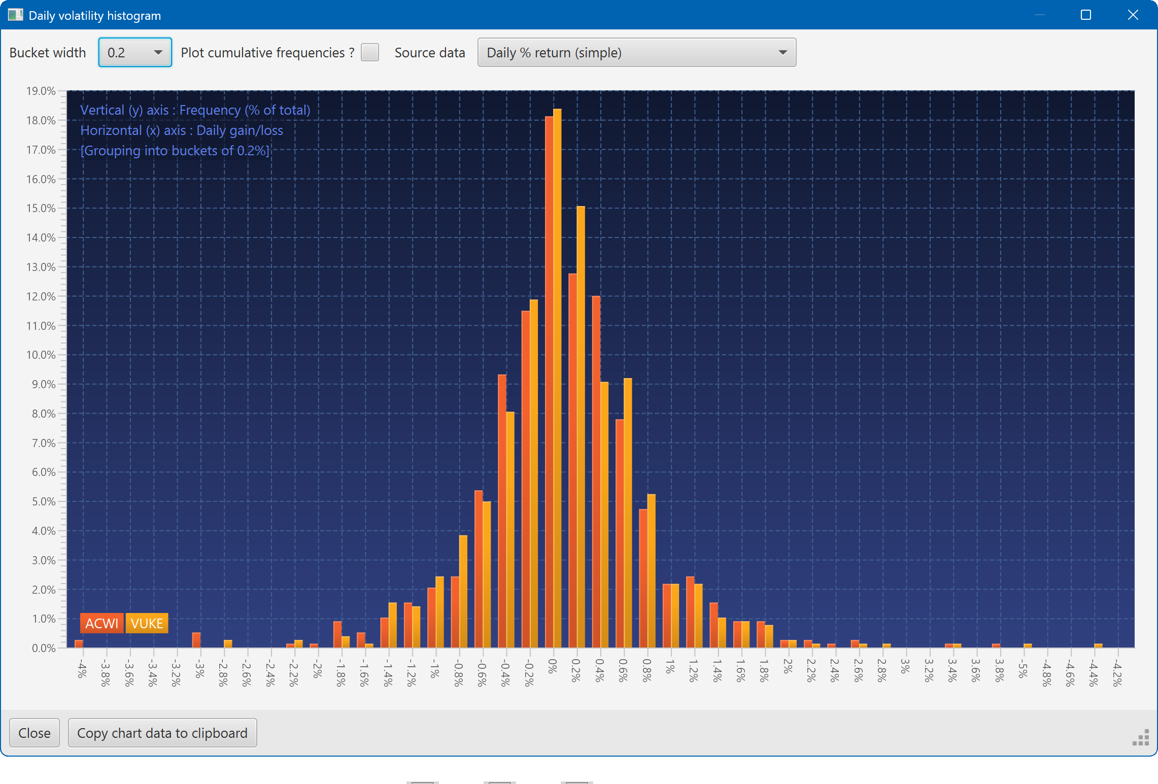
A histogram showing the daily returns of two securities, overlaid
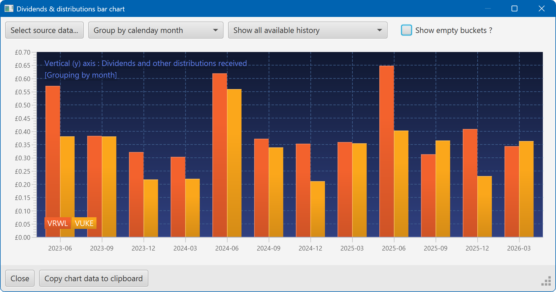
A bar chart showing the dividend history of two securities