
Portly was hand-written by humans (me, specifically) with minimal AI input. For the moment, at least, I believe that nothing beats good old-fashioned human craftsmanship !

Chart shortcuts
The following keys can be used to quickly launch charts from many screens of the app. Note that the exact behaviour may depend on how many items you have selected (remember that you can select multiple items by holding down CTRL while left-clicking).
| v | valuation chart | shows the market value of the selected position(s) over time |
| t | total returns chart | shows the absolute growth of your position (capital gains plus income) |
| g | growth chart | Shows the percentage growth of your position (capital gains plus income) |
| a | allocations chart | shows valuation of selected positions, expressed as % of entire portfolio |
| c | cashflows bar chart | shows all cash movements in and out |
| d | dividends bar chart | shows all dividend income & any other distributions |
| b | bucketed returns bar chart | shows total returns, grouped by time bucket |
| p | price chart | for individual securities, shows the unit price |
| q | quantity chart | for individual securities, shows the total amount owned |
Table shortcuts
These keys work when you're viewing tables of data (eg lists of accounts, securities, transactions etc)
| ENTER | Show more detail |
| INS | add a new row |
| DEL | delete the selected row(s) |
| ctrl-C | copy selected rows to the clipboard |
| ctrl-A | select all rows (also works on the heatmaps to select all regions) |
| s | In the position browser, this toggles between security-level view |
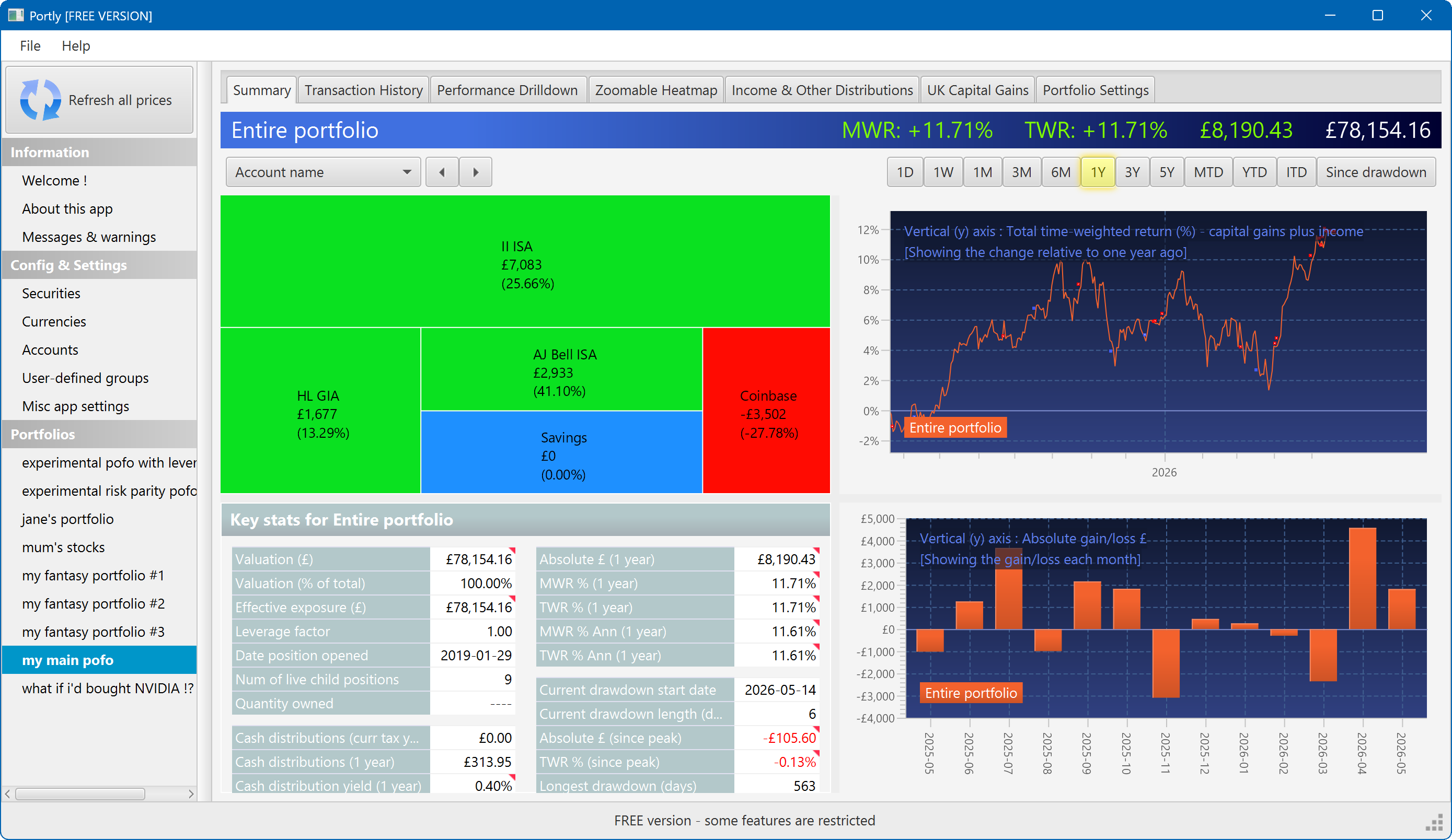
The summary screen gives an at-a-glance overview of your portfolio's performance. To read more about it, click here
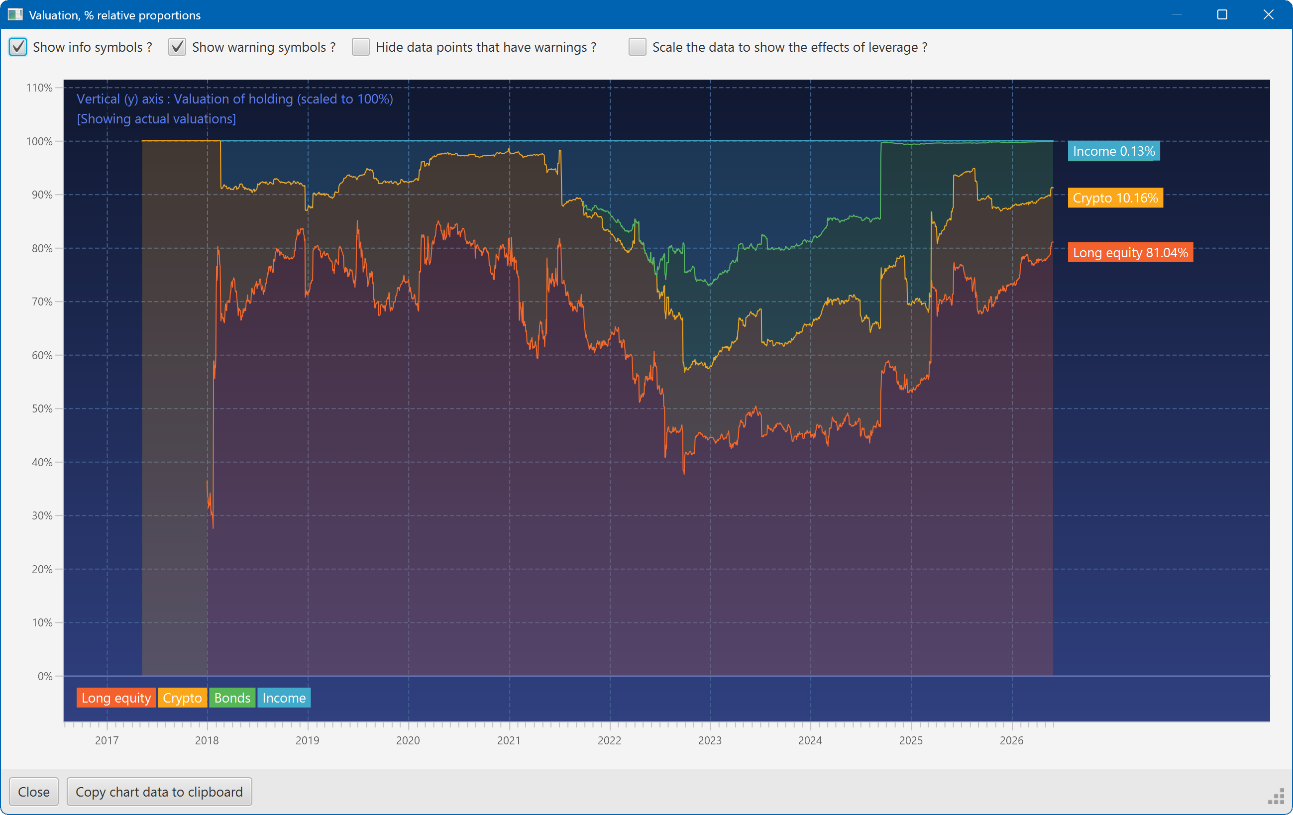
This plot shows the changing composition of a portfolio over time. It uses user-defined groups to organise the assets into different classes.
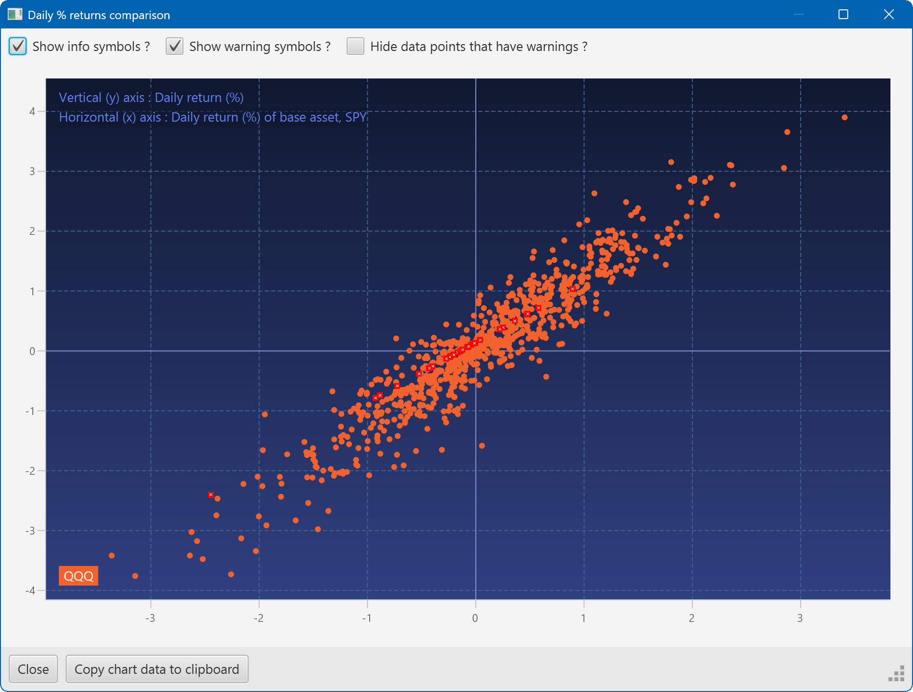
A scatter plot, showing how the daily moves of one security (QQQ) relate to the daily moves of another (SPY)
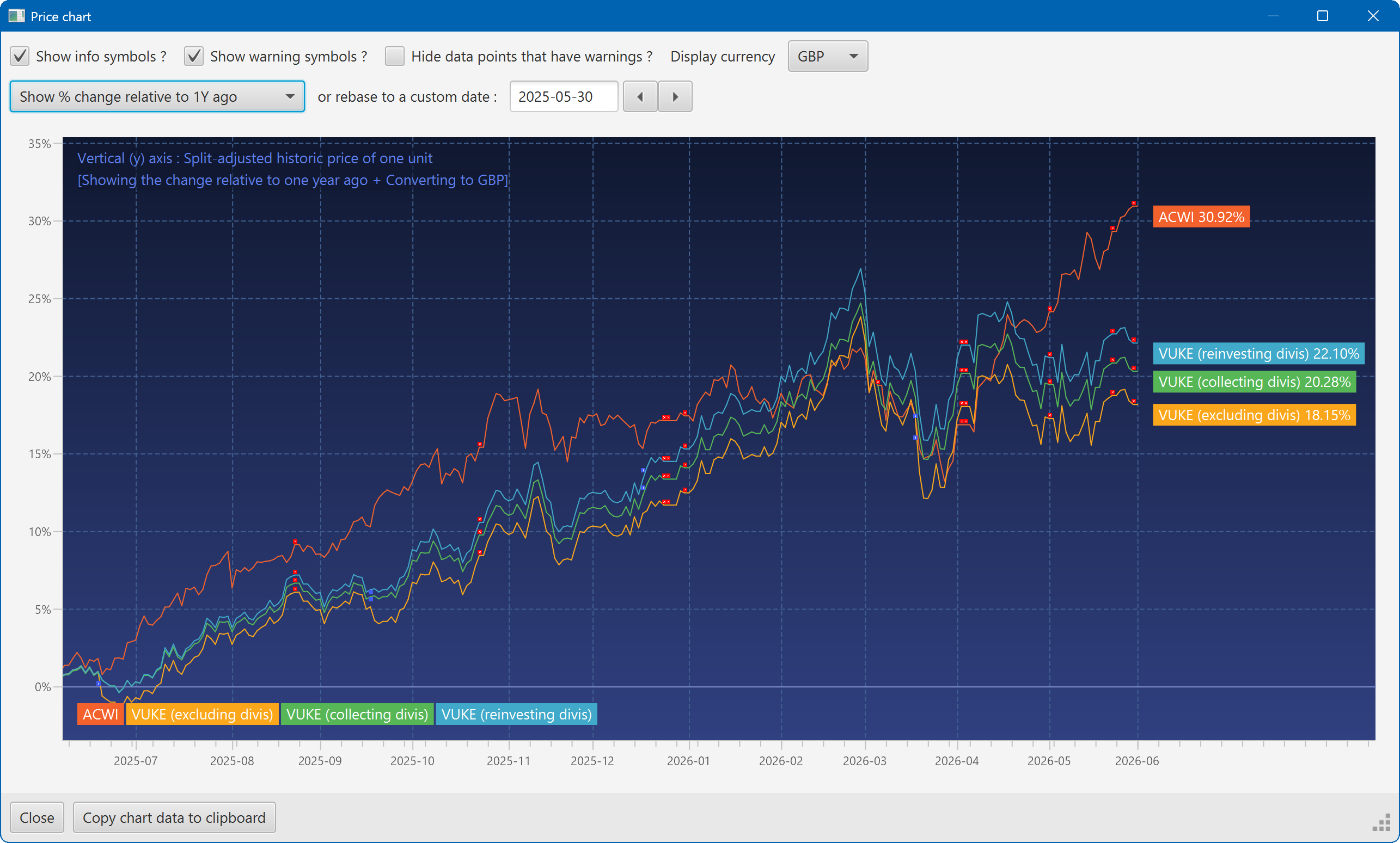
A chart showing the growth of two securities over the past year
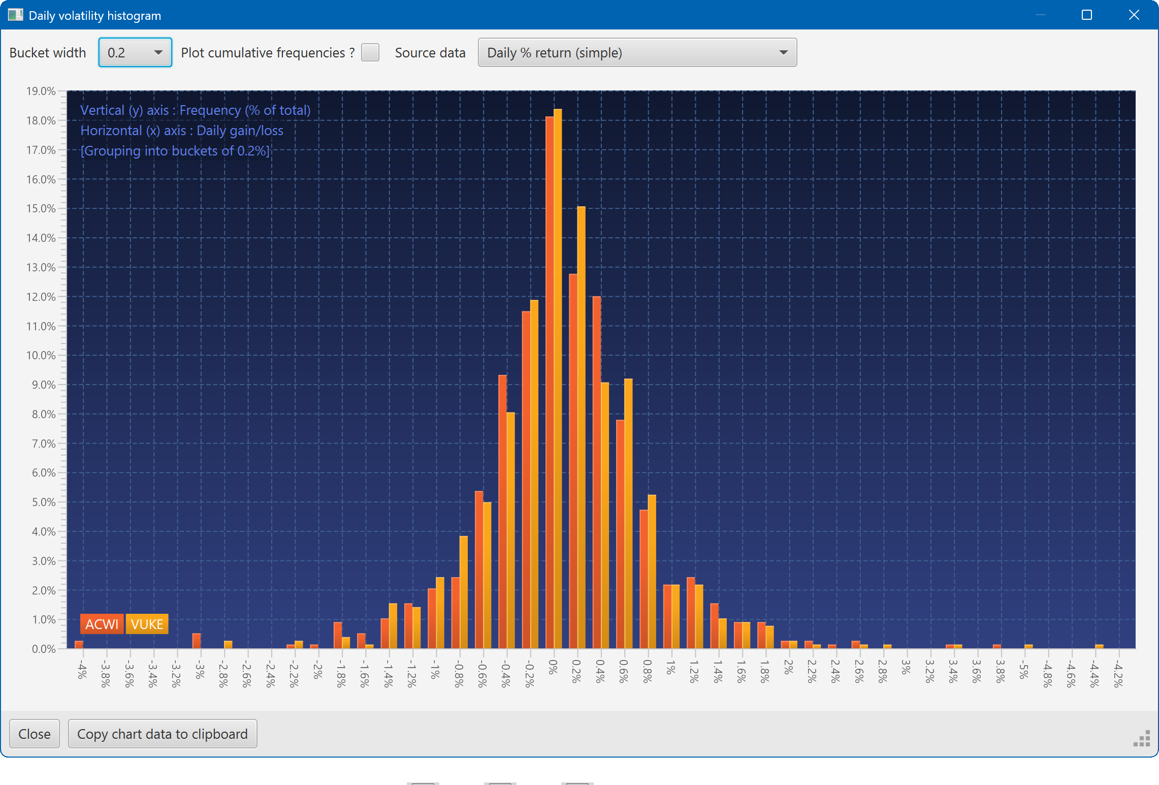
A histogram showing the daily returns of two securities, overlaid
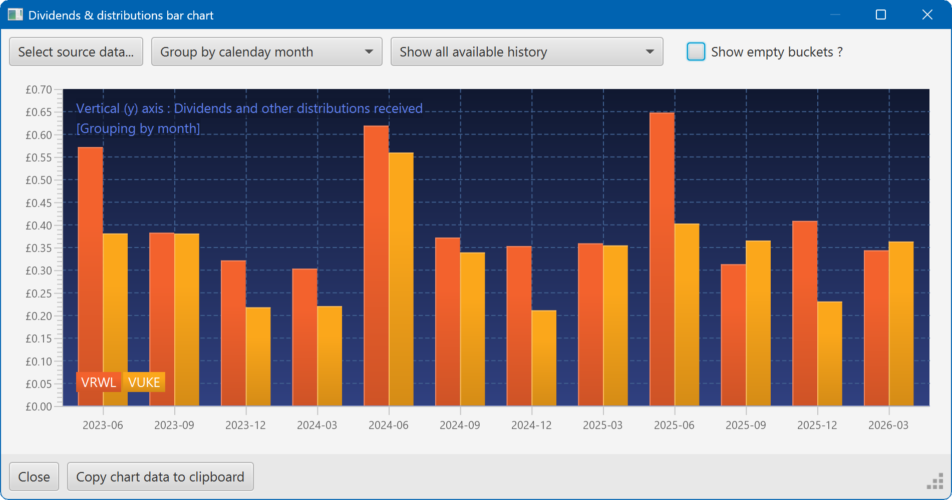
A bar chart showing the dividend history of two securities