
Portly was hand-written by humans (me, specifically) with minimal AI input. For the moment, at least, I believe that nothing beats good old-fashioned human craftsmanship !

Support for leveraged ETFs in Portly
Leveraged ETFs are an increasingly popular choice amongst investors who wish to increase their exposure to the markets without having to take out margin loans. One of the challenges with owning these products is that the market value of the ETF is different from the effective exposure that it gives you. Take the case of a 3x leveraged fund : if you hold 10K of this ETF, you've effectively got 30K exposure to the underlying market. If you're not careful, you can inadvertently take on more risk than you intended.
To help you manage your levered exposure, Portly allows you to specify a leverage factor when defining the security :
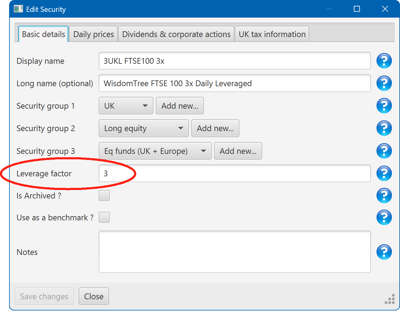
Portly can then use this information in several differnet ways :
Viewing leverage on the Summary tab
There are several ways you can see information about your portfolio's leverage using the summary tab
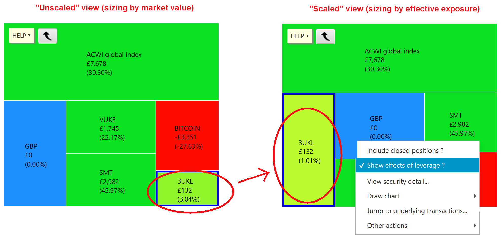
The most direct method is to look at the heatmap. By default, the heatmap automatically scales up the area of regions that have leverage greater than 1. So for example, a 3x leveraged ETF would be shown three times larger than a 1x leveraged position. At the same time, the percentage growth is scaled down by the same amount (so for example, if the ETF gained 3% over a month, the region would be coloured as if it had experienced only 1% growth). The basic idea is to represent any leveraged positions as if they were unleveraged, to make it easier to compare with other investments.
Note that you can switch this behaviour off by right-clicking on the heatmap and deselecting the relevant option. The following picture shows how the heatmap changes when you change the flag :
Note also that you can choose to group the heatmap using the leverage factor of each security. This lets you quickly separate out the performance of all 1x investments from the performance of all 2x and 3x investments, combined :
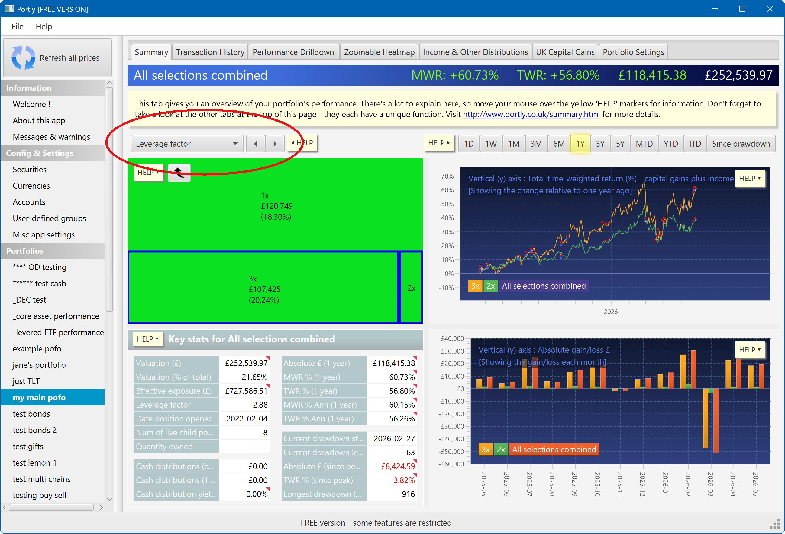
The values in the lower-left details pane can also help you monitor your risk :
Visualising leverage using charts
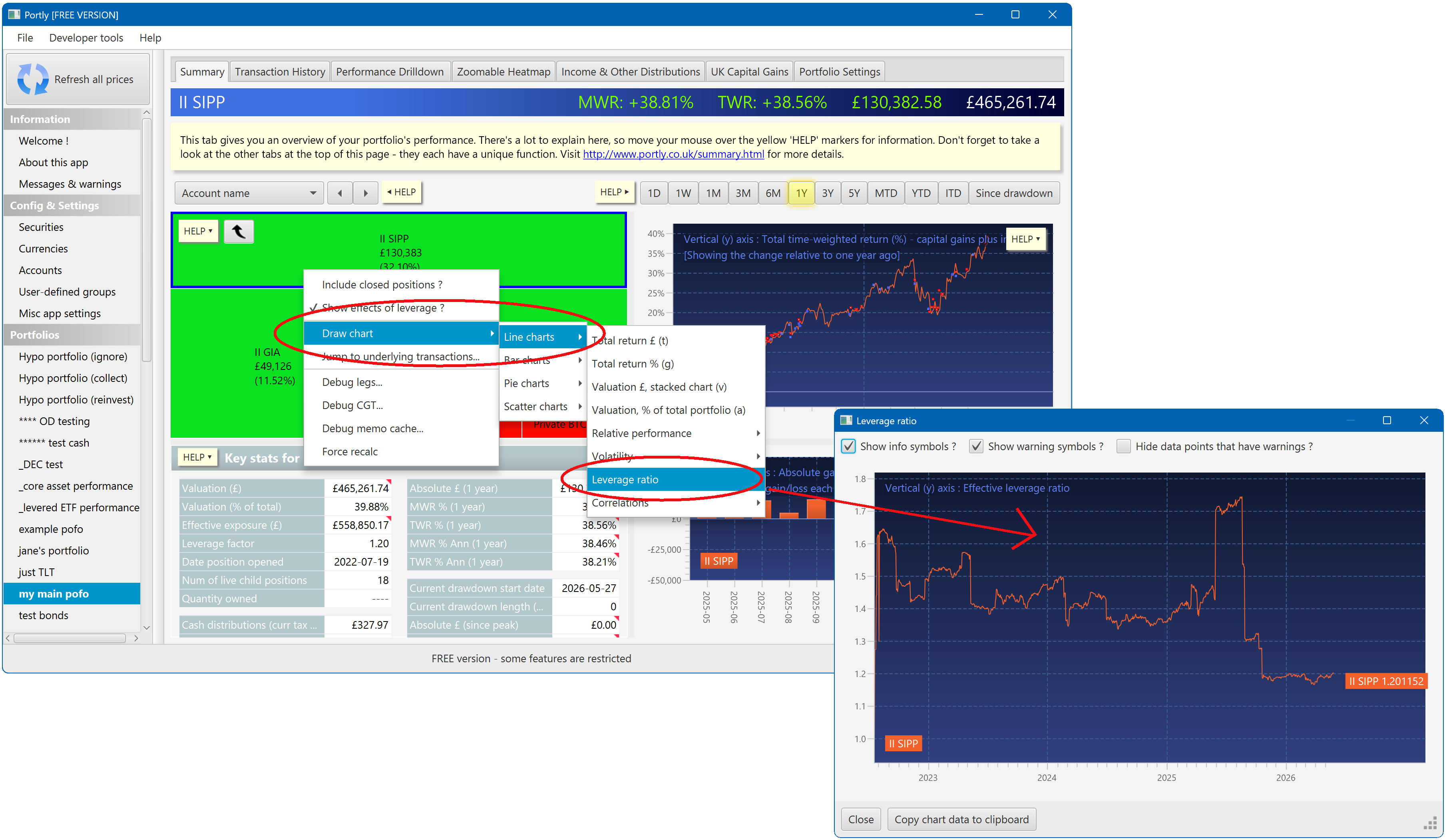
You can directly plot the leverage factor of your portfolio over time. Here's the relevant menu item :
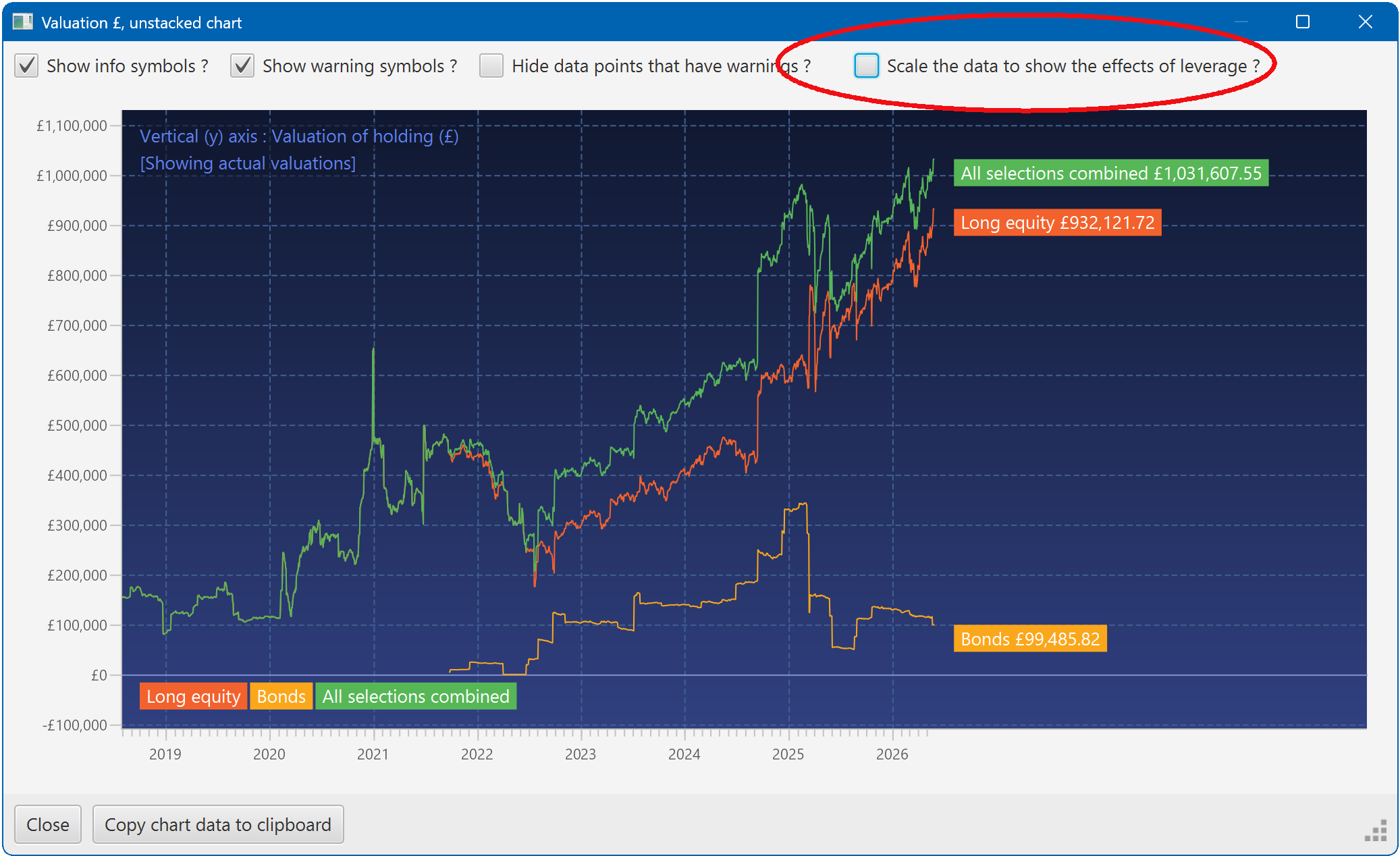
In addition, certain charts have a "show leverage ?" checkbox. This lets you choose between plotting the actual market value of a position, or its effective exposure. You'll find this option on all valuation-related charts.
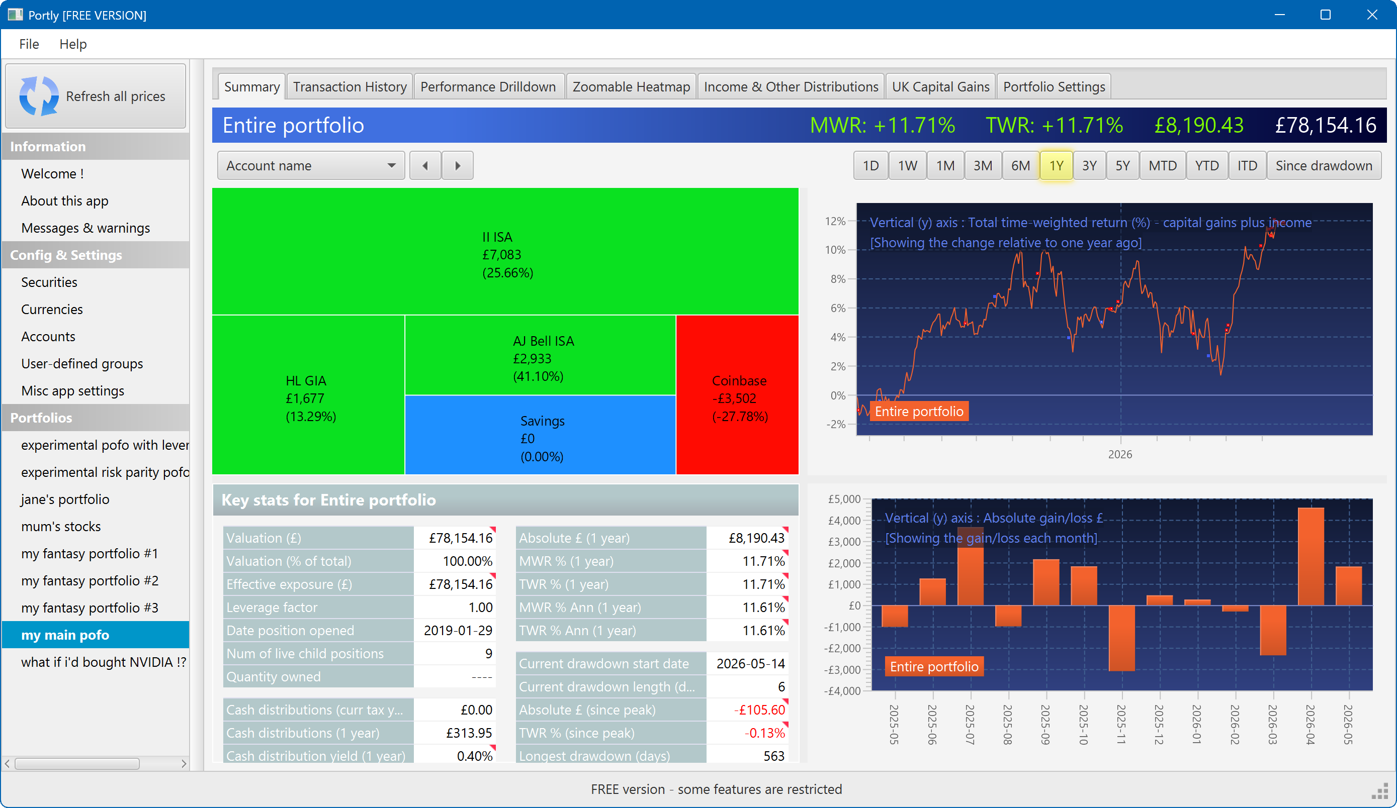
The summary screen gives an at-a-glance overview of your portfolio's performance. To read more about it, click here
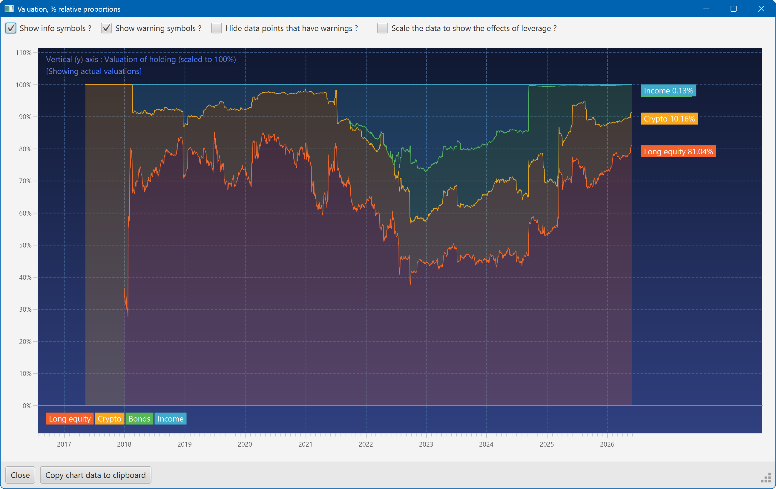
This plot shows the changing composition of a portfolio over time. It uses user-defined groups to organise the assets into different classes.
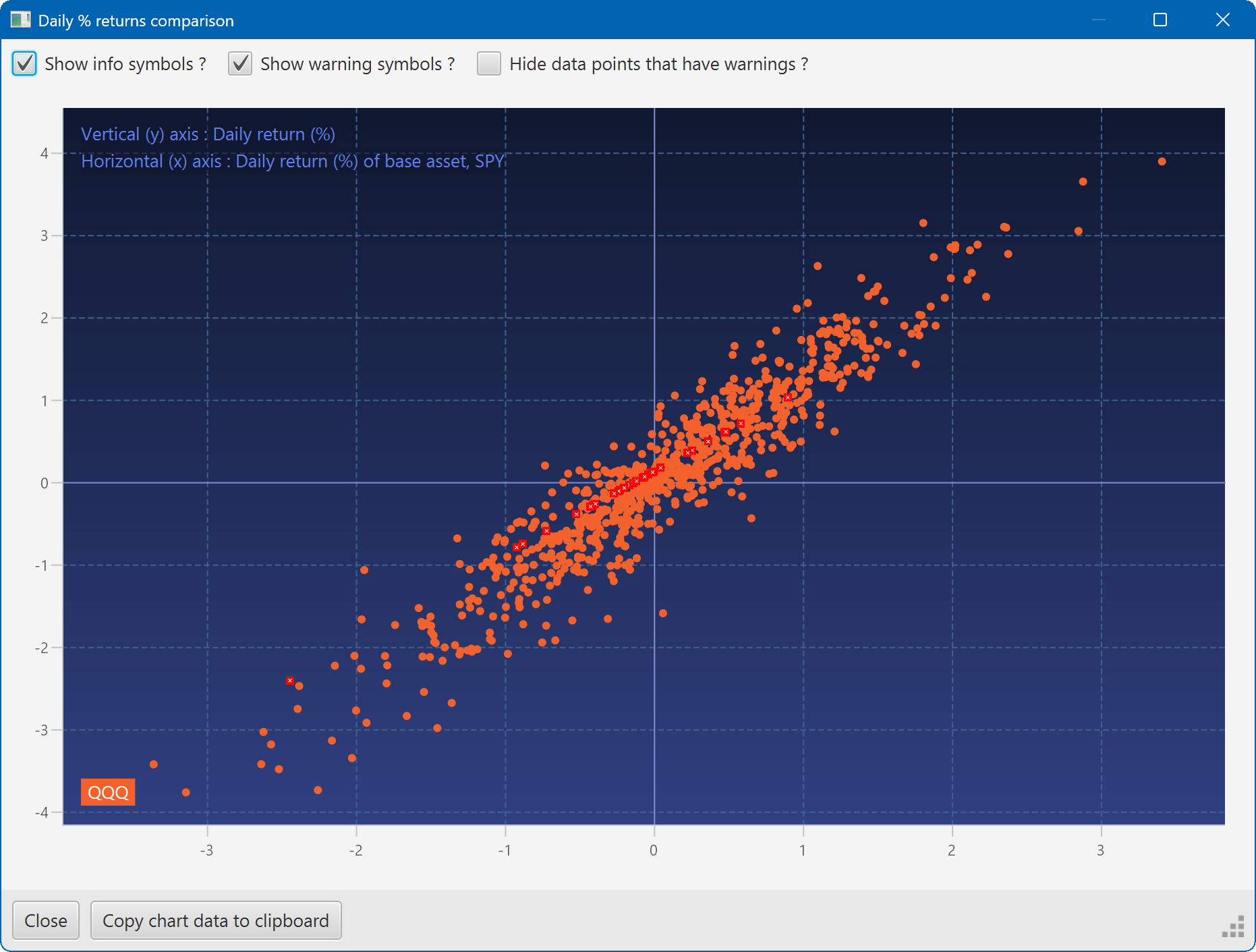
A scatter plot, showing how the daily moves of one security (QQQ) relate to the daily moves of another (SPY)
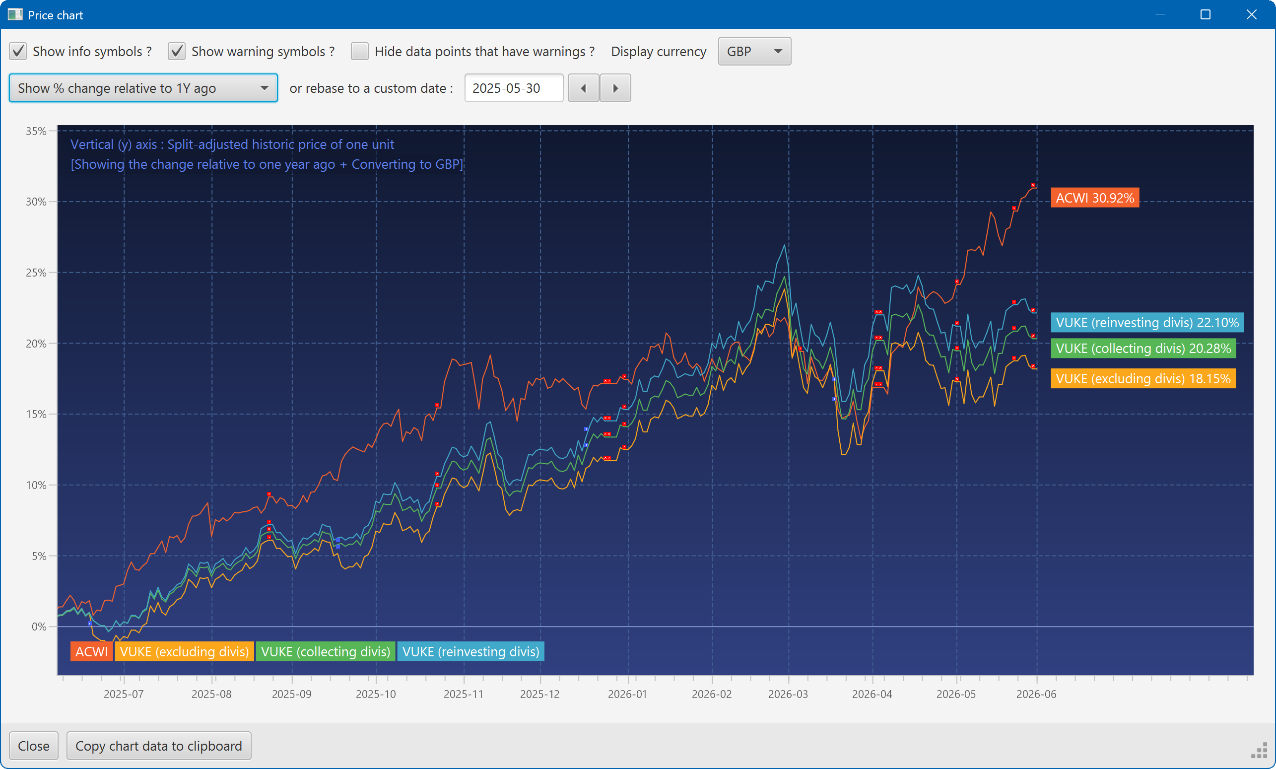
A chart showing the growth of two securities over the past year
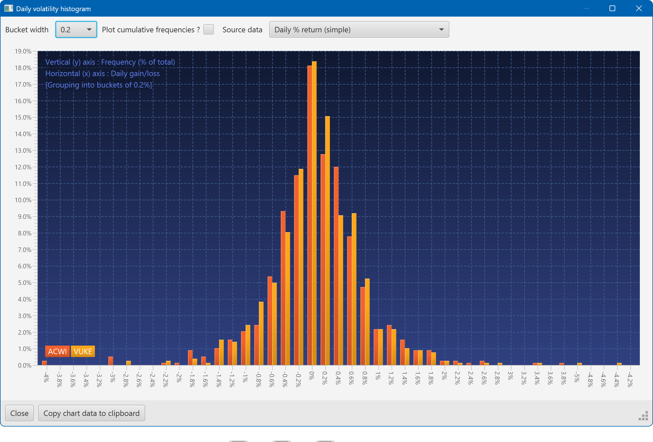
A histogram showing the daily returns of two securities, overlaid
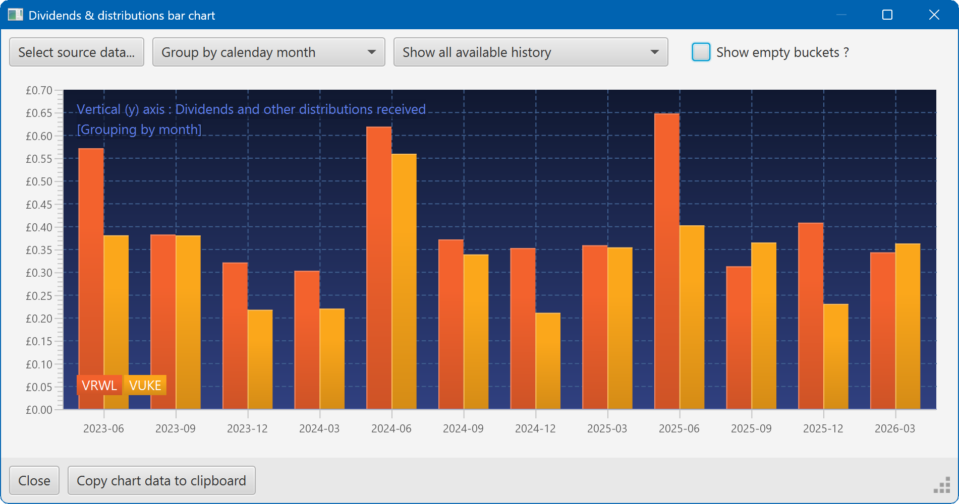
A bar chart showing the dividend history of two securities