
Portly was hand-written by humans (me, specifically) with minimal AI input. For the moment, at least, I believe that nothing beats good old-fashioned human craftsmanship !

The portfolio summary screen
As the name suggests, the summary screen provides an at-a-glance overview of your portfolio. It can seem complicated at first, so let's run through the various components one by one.
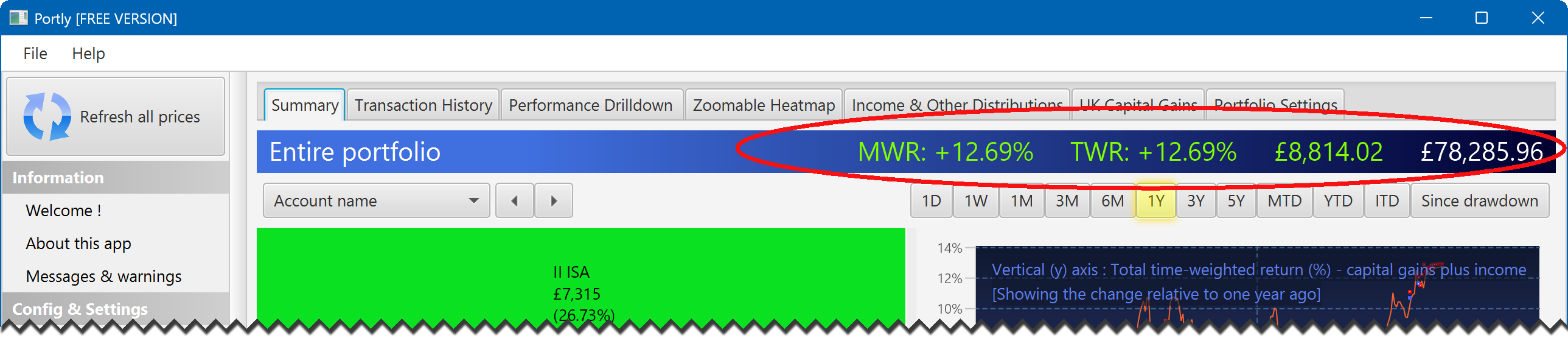
The title bar
At the very top of the screen is a shaded title bar that shows you (from left to right) the total money-weighted return (MWR) of your portfolio, the total time-weighted return (TWR), the absolute return and the current valuation.
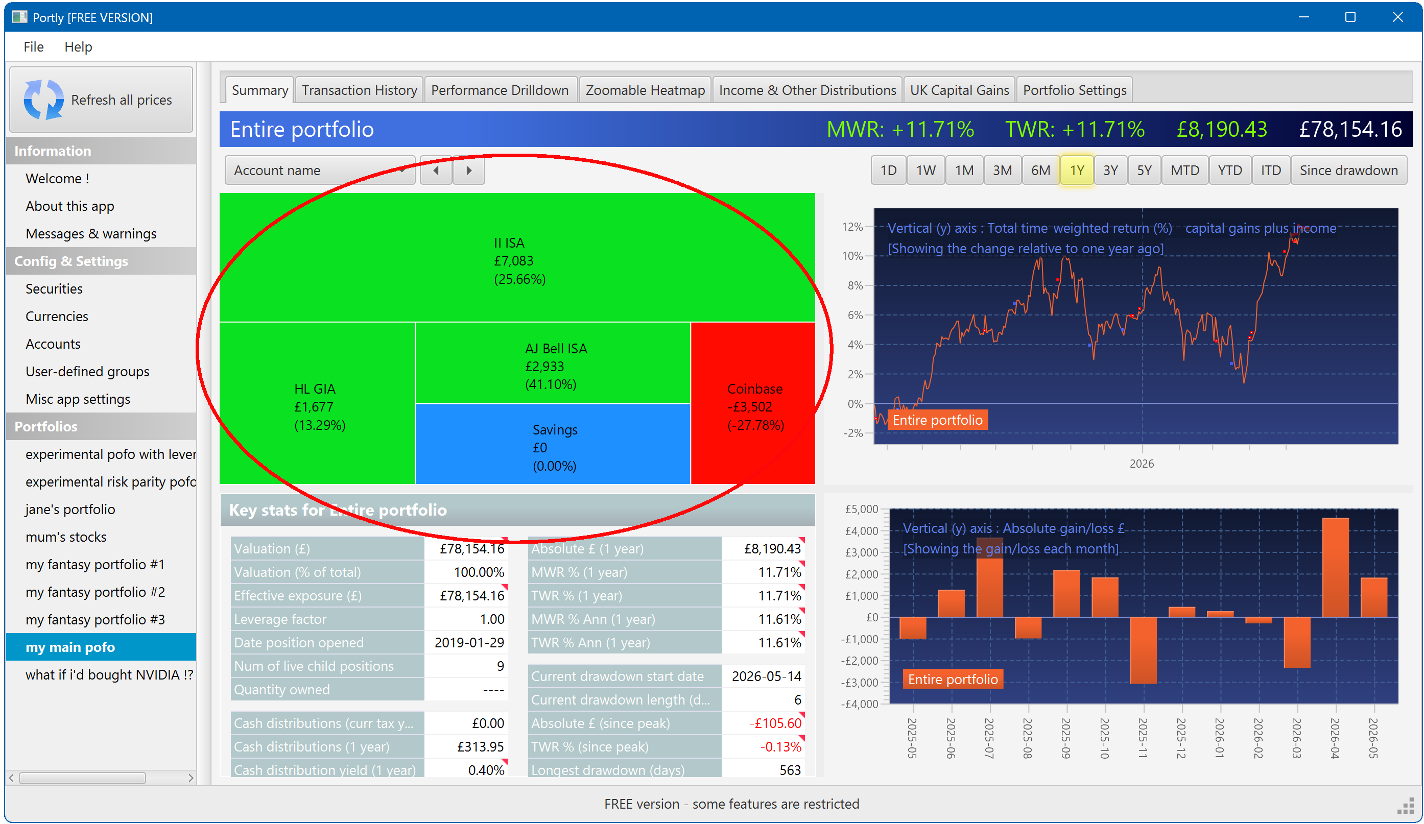
The heatmap
In the top-left corner is a heatmap that gives you a bit more insight into the portfolio's performance. Each region of the heatmap represents one of the positions that make up your portfolio. The area of the region represents the current market value of that position, while the colour represents its performance over a 1 year period (we'll see how to change this shortly). Each region of the heatmap also has a text label showing the absolute return (expressed in your local currency), plus the percentage 1Y gain or loss (calculated as the time-weighted return) :
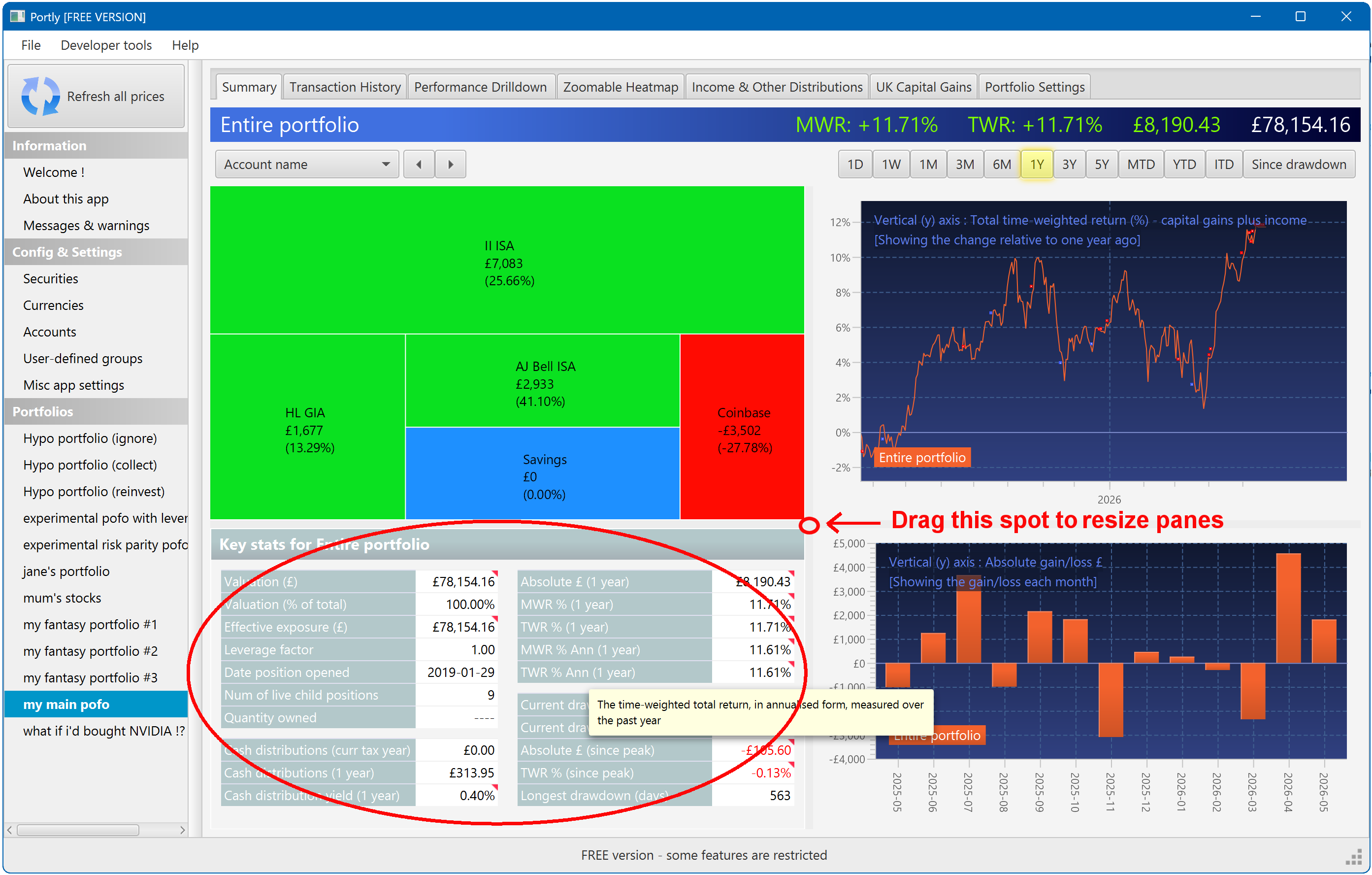
The key statistics table
Below the heatmap is a table that displays a series of performance-related statistics and other useful information. Hover the mouse over any of the labels for a more detailed description of how that quantity is defined and calculated. Note that if the table seems too 'squashed' on your screen, you can make it larger using the splitter bar (labelled in the picture) :
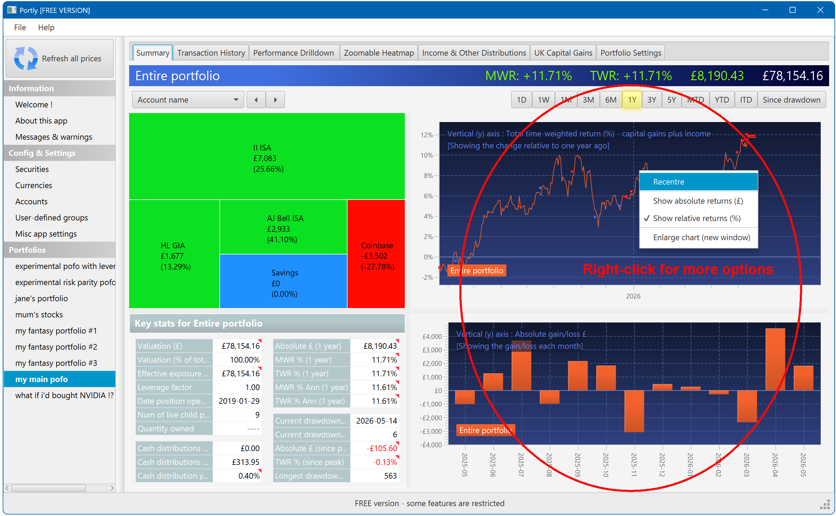
Performance charts
To the right are two charts showing the performance of the portfolio over time. By default, the line chart shows the percentage return while the bar-chart shows the absolute return. You can change this by right-clicking on either chart :
Interacting with the summary screen
Now we've introduced the basic components of the summary screen, let's learn about some of its interactive features.
Changing the time window
You can use the 'time selector' buttons at the top of the screen to change the trailing window over which the performance is calculated. Select 1M to see trailing 1 month returns, YTD to see year-to-date, etc. ('ITD' is short for 'inception-to-date', which shows you the entire lifetime of the position).
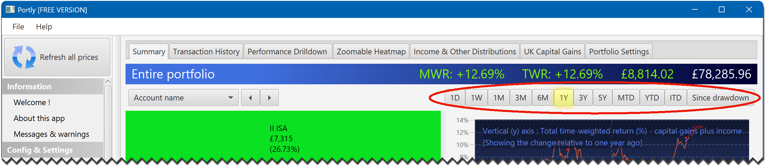
Note that all four panels move in lock-step. When you change the time selection at the top of the screen, they will all update themselves at the same time.
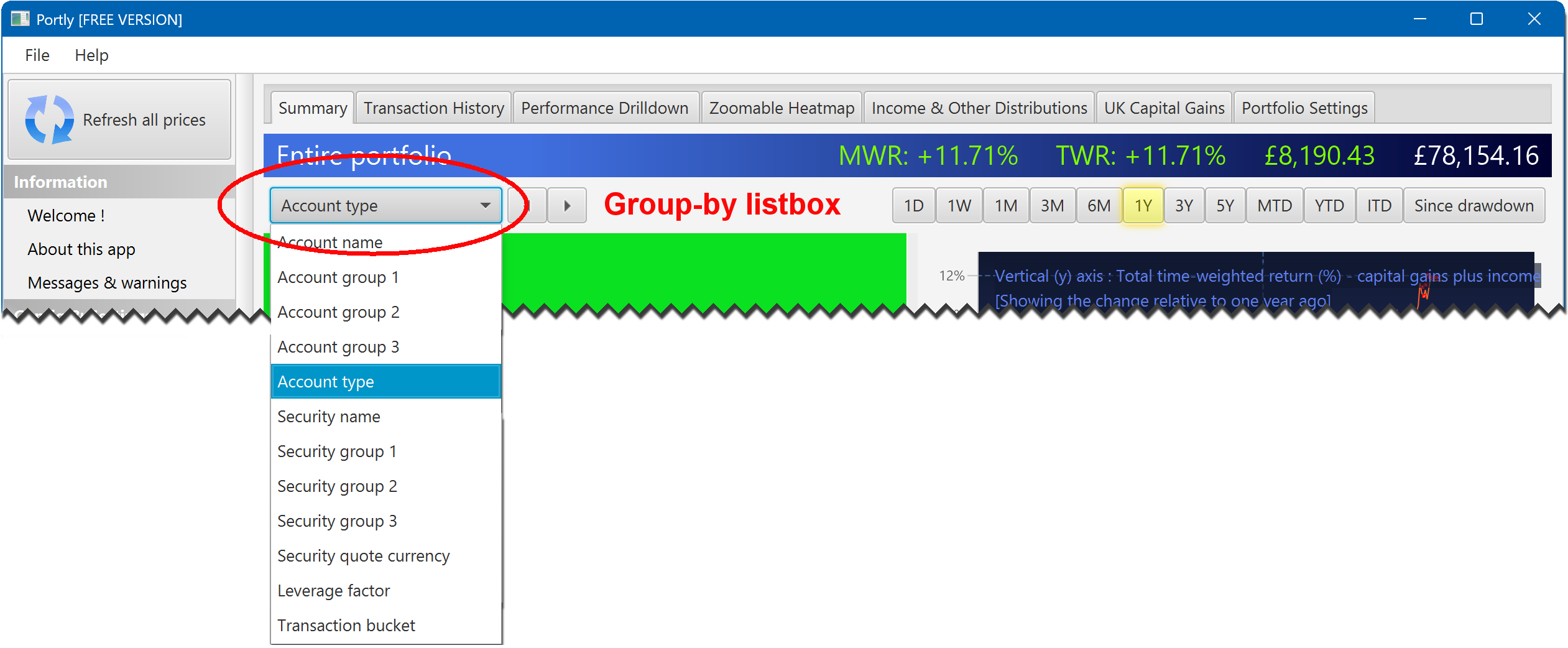
Changing the heatmap grouping
You can change how the heatmap is organised using the group-by listbox at the top of the screen. If you select 'Account type', for example, the heatmap will be grouped by the type of account (ISA/SIPP/GIA). If you select 'Security name', you'll be able to see the individual securities that make up your portfolio. You can also group by any user-defined categories that you have defined.
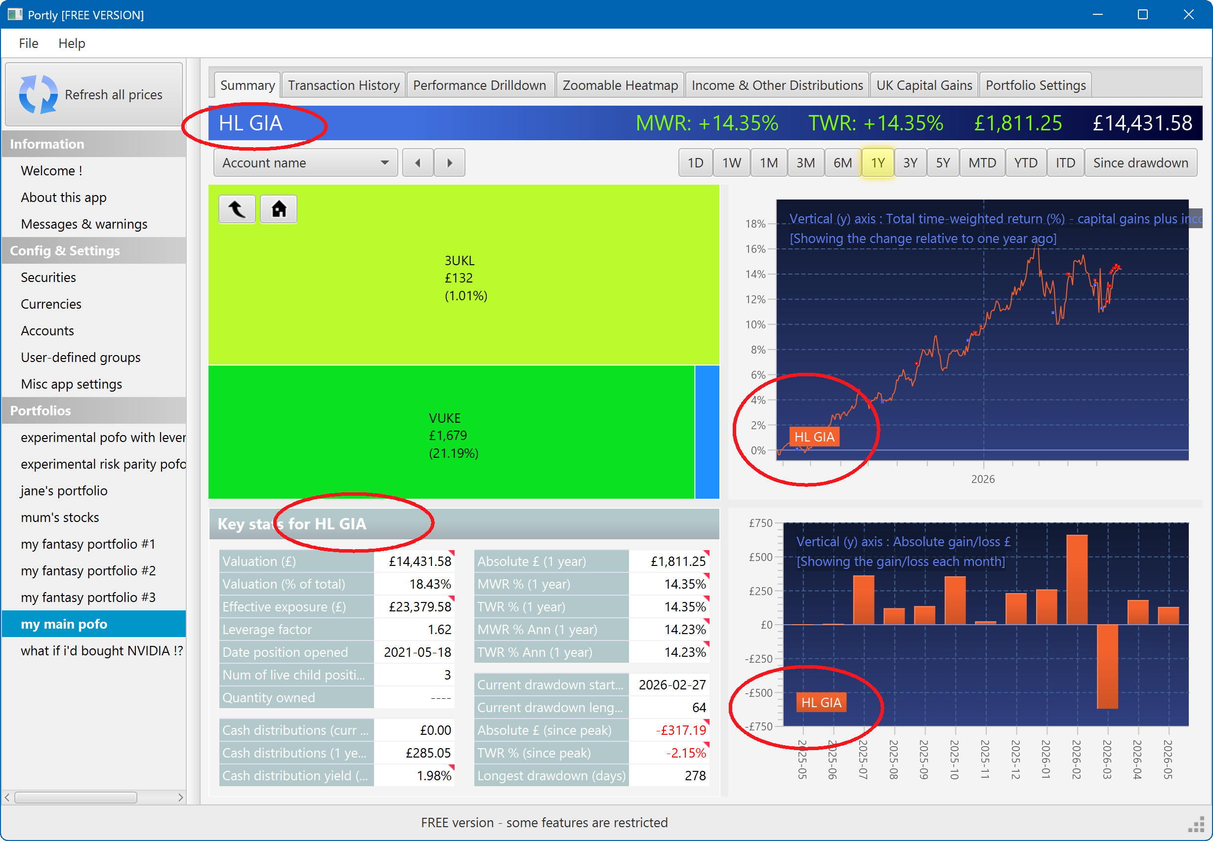
Zooming in to individual positions
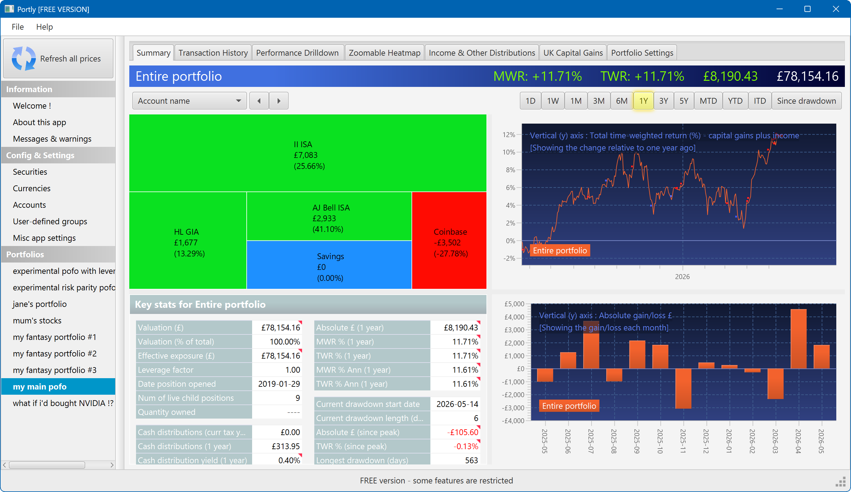
The heatmap enables you to explore your portfolio's contents, much as you'd explore a series of folder on your computer. To do this, left-click on any area of the heatmap to 'zoom in' and view the individual securities that make up that position. Notice that when you do this, the other 3 panels immediately update to follow your selection. In the following picture, for example, I clicked on the 'HL GIA' region. The entire screen is updated to show me the performance of that position in isolation. All the text and charts now refer to 'HL GIA' to remind me that i'm no longer looking at the entire portfolio.
I can zoom one level deeper by clicking on a single security. The screen changes again. Now I'm focussed exclusively on the 'VUKE' security that's contained inside the 'HL GIA' account :
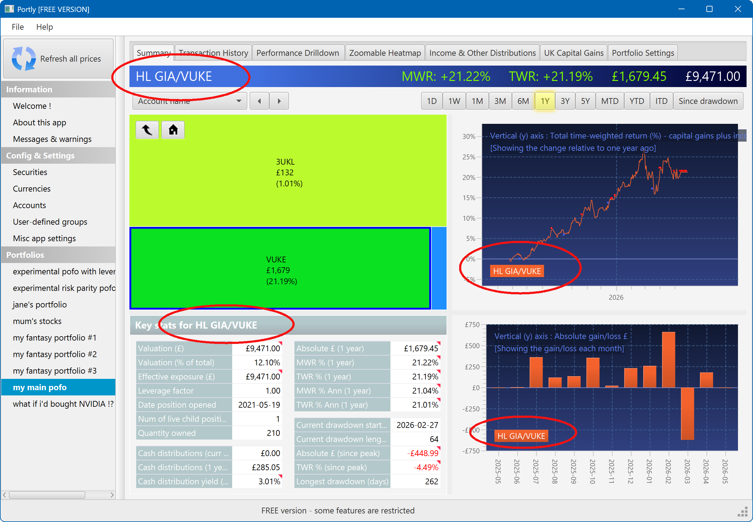
To return to the previous zoom level, click the 'go back' button (on the left). To return to the top-level view, just click the 'home' button (on the right) :

Selecting multiple positions at once
Middle-click on the heatmap to select more than once positions at once. When you do this, something interesting happens ! The performance charts now show one line (or series) for each position that you have selected, as you might expect. But there's also an extra entry labelled 'all selections combined'. This represents the aggregate performance of all the positions that you have selected, combined. Other areas of the screen also display the aggregate performance. You can continue to add (or remove) positions by middle-clicking, and the screen will refresh automatically :
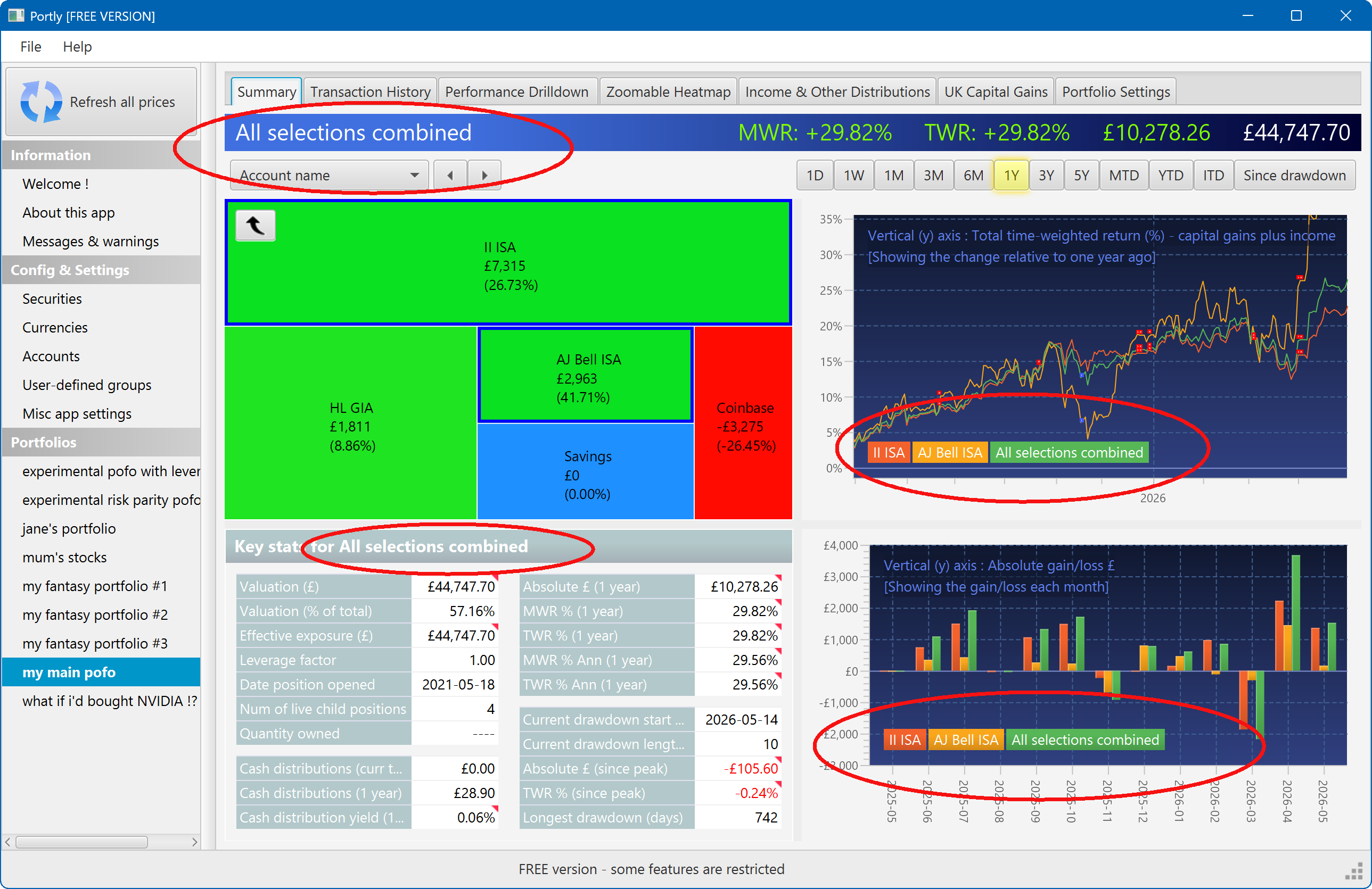
The multi-select feature can be powerful way to explore your portfolio interactively, and to help understand how well each asset 'blends' with all the others.
Launching charts
It's also possible to launch a variety of different charts directly from the heatmap. To do this, select the region(s) you're interested in using the middle button, then right-click to summon a popup menu :
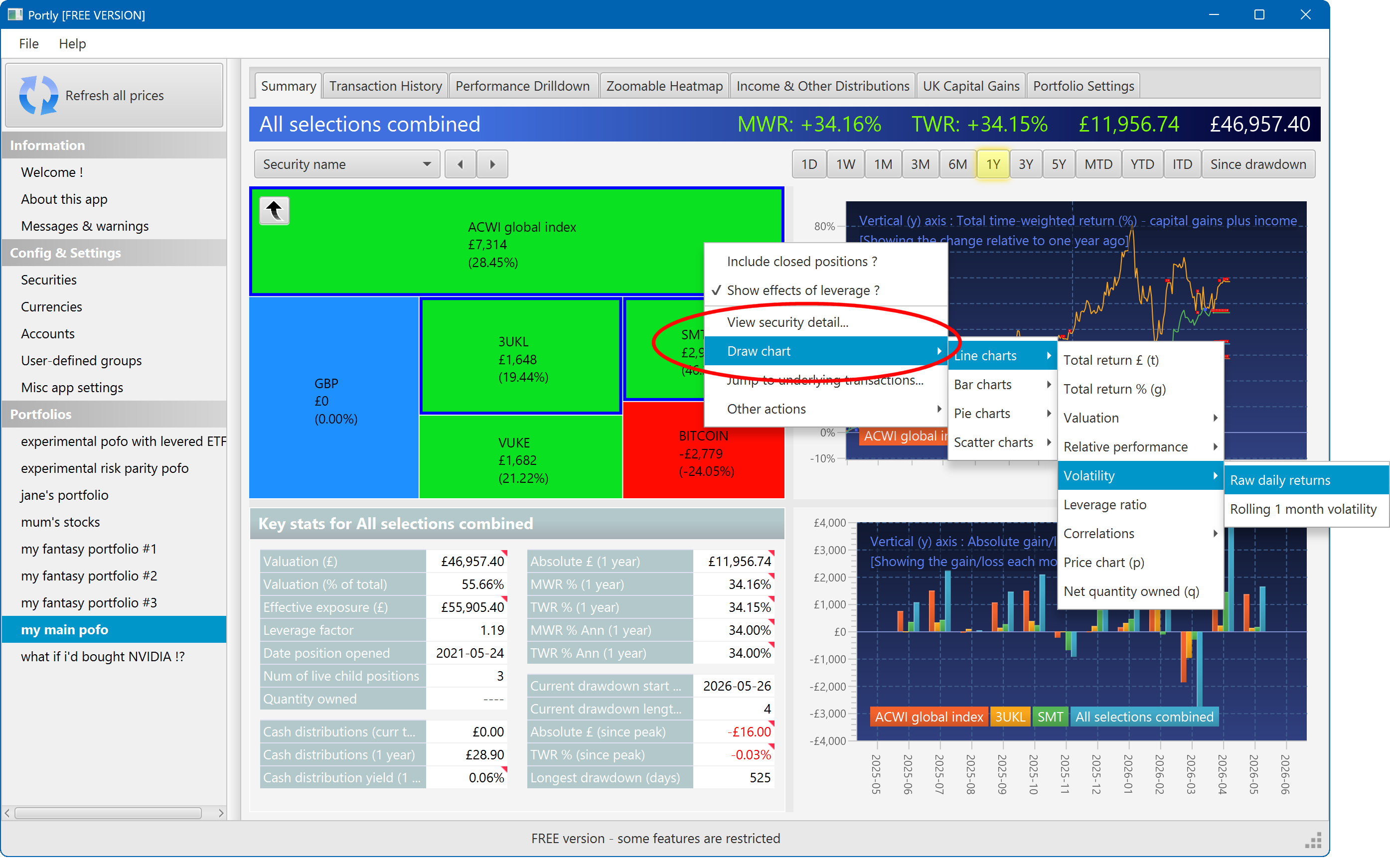
More advanced users may prefer to use one of the shortcut keys to save time.
The summary screen gives an at-a-glance overview of your portfolio's performance. To read more about it, click here
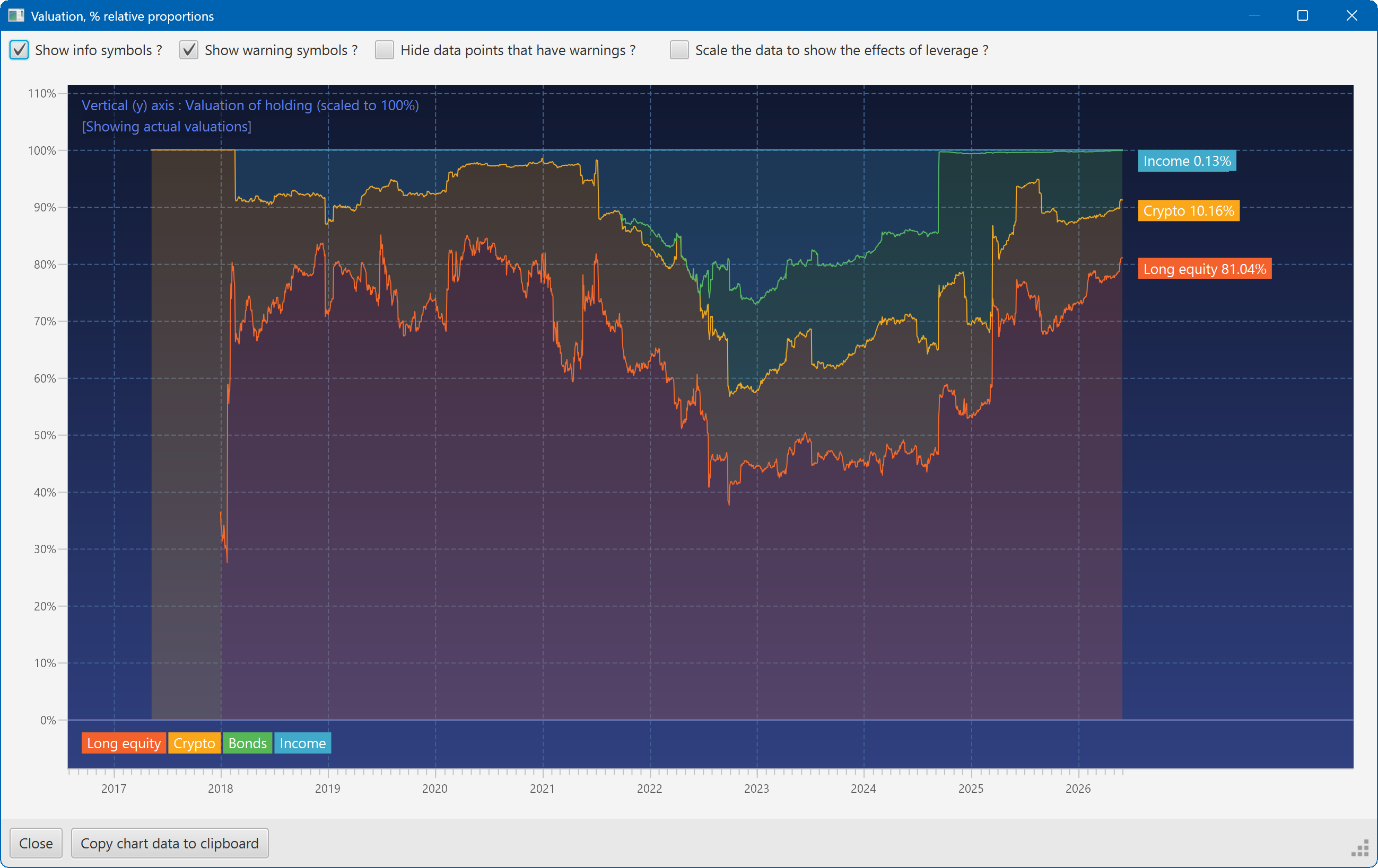
This plot shows the changing composition of a portfolio over time. It uses user-defined groups to organise the assets into different classes.
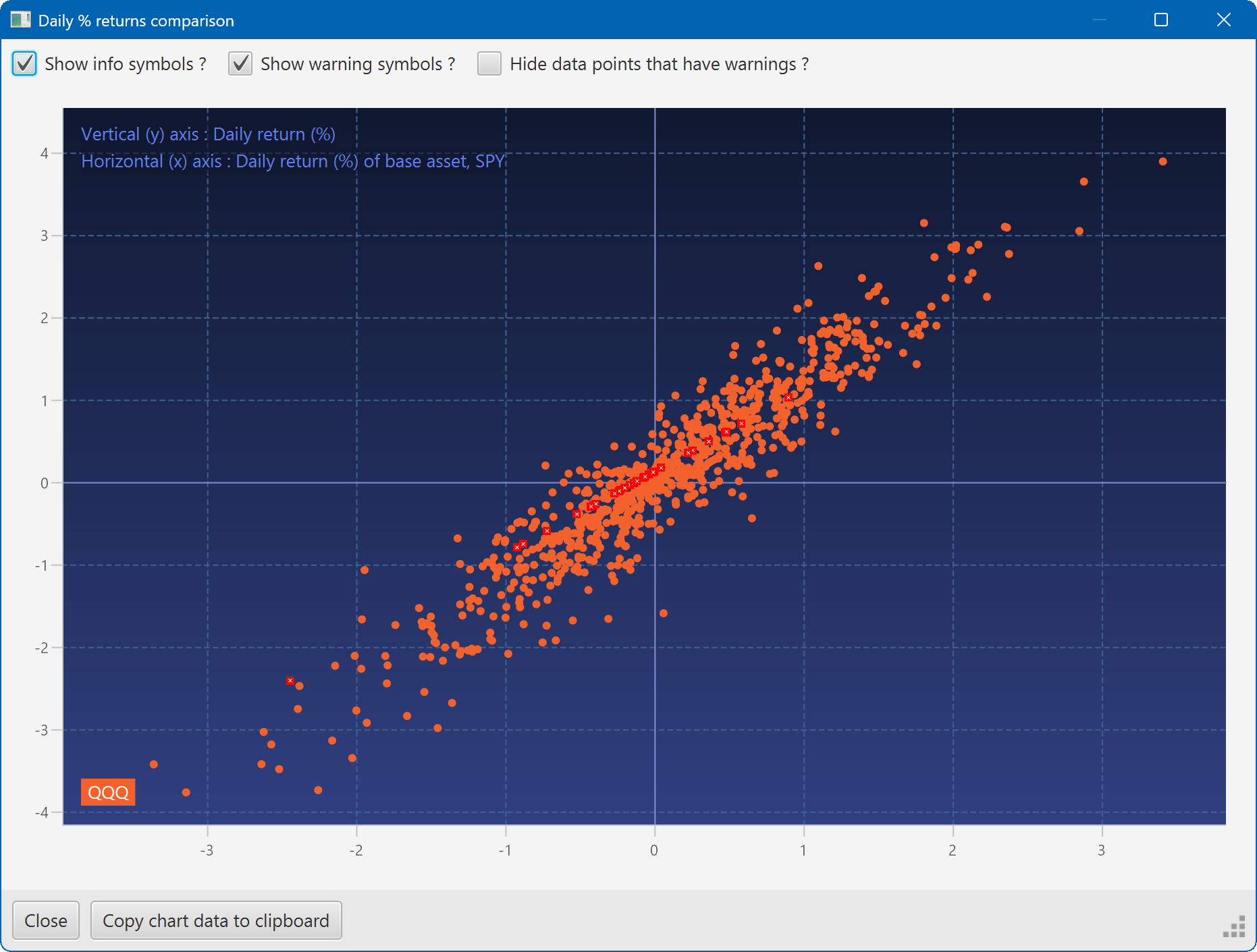
A scatter plot, showing how the daily moves of one security (QQQ) relate to the daily moves of another (SPY)
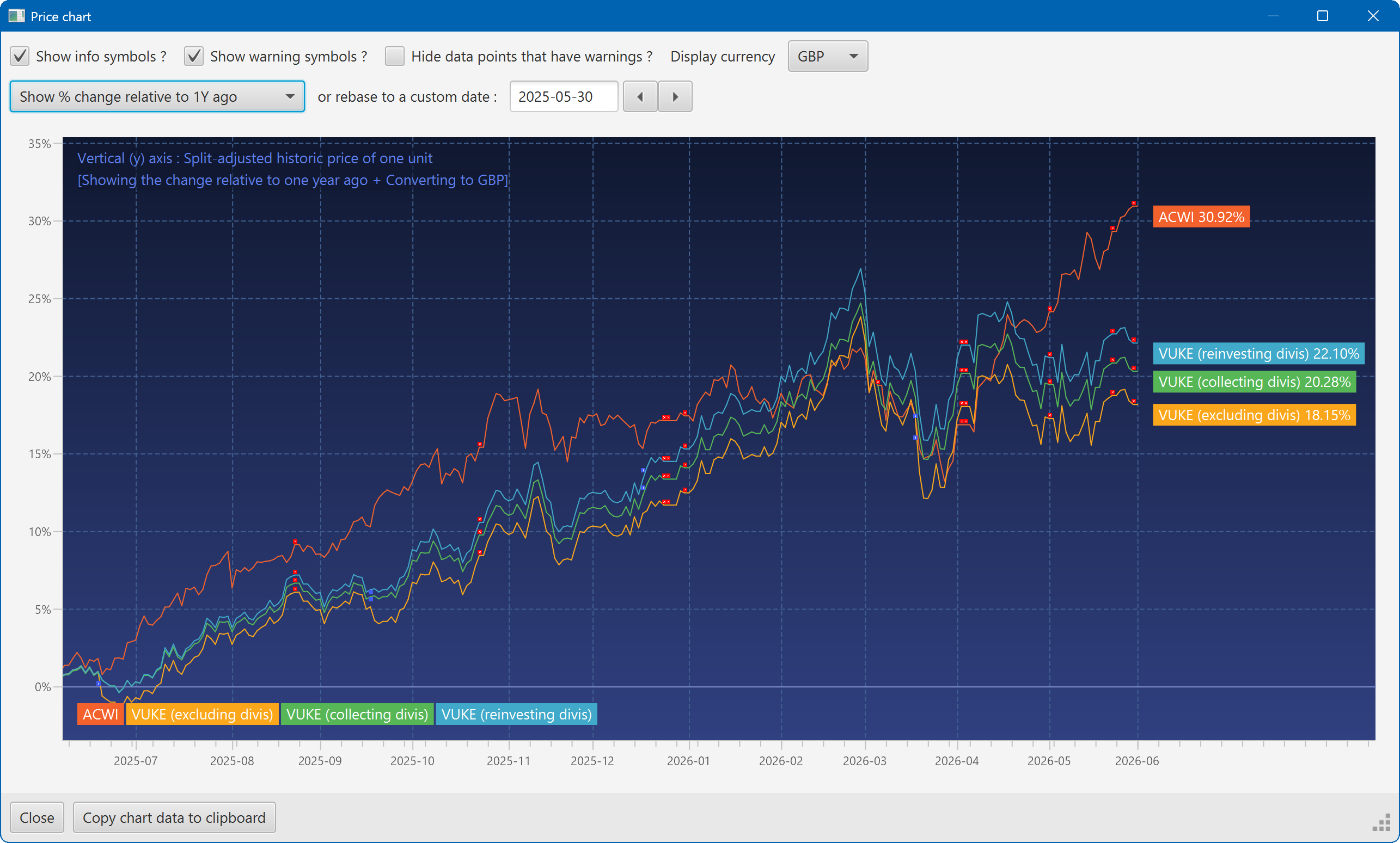
A chart showing the growth of two securities over the past year
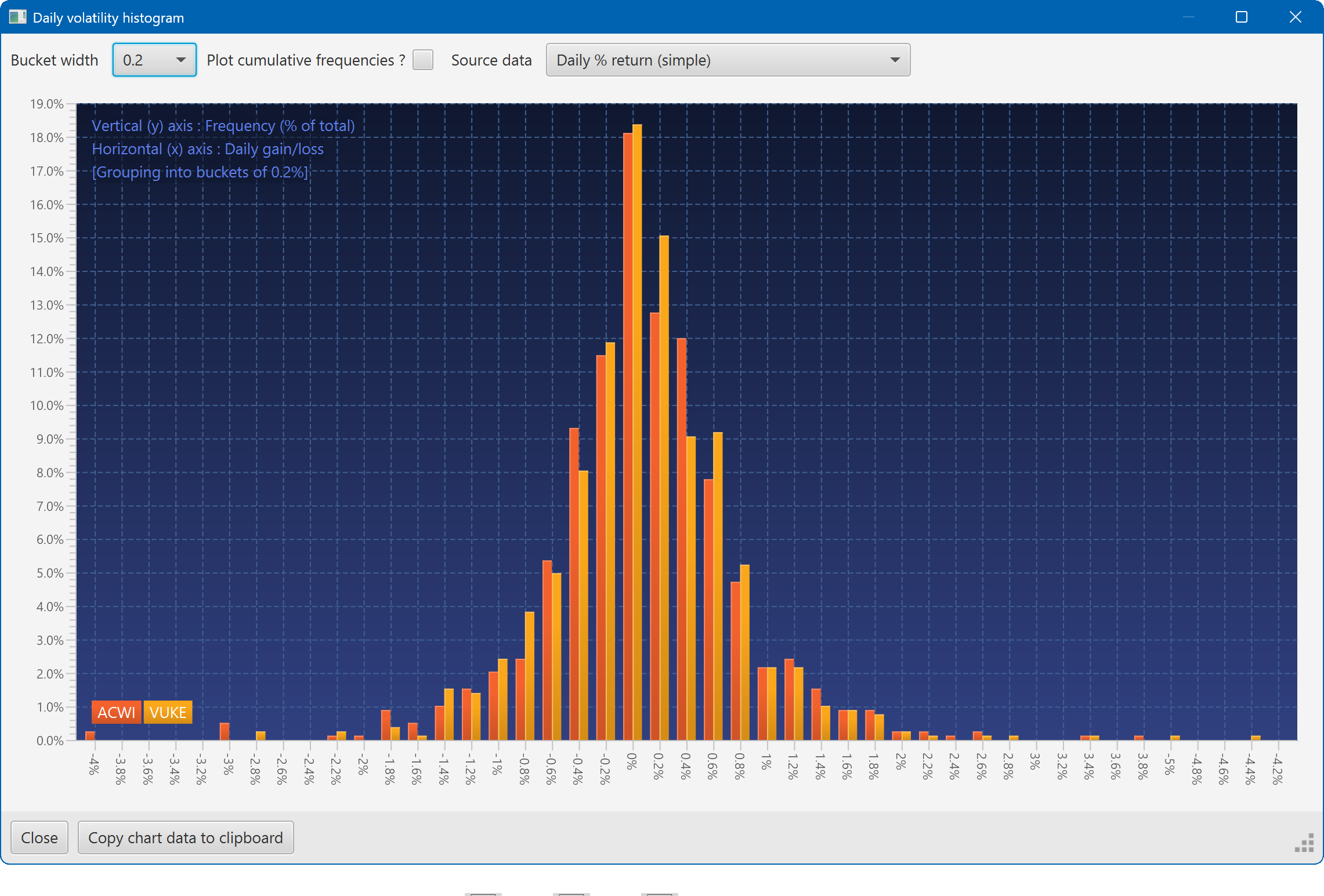
A histogram showing the daily returns of two securities, overlaid
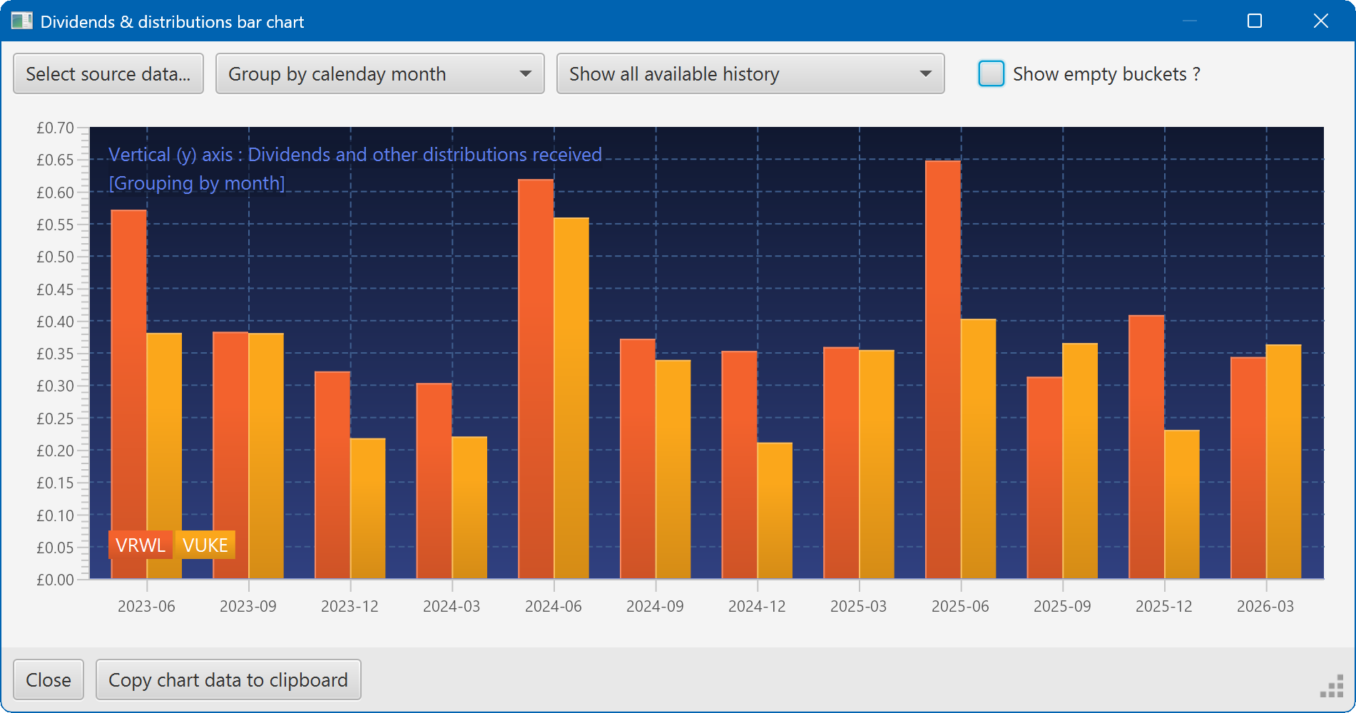
A bar chart showing the dividend history of two securities